SEPA XML GENERATOR – An Interactive Design Project
SEPA XML GENERATOR – Project Background
The subject software application under review is referred to as a SEPA XML GENERATOR (www.SEPAXMLGENERATOR.com). The Application allows business owners to collect direct debits from customers by generating an xml file. The xml file contains customer financial information such as IBAN/BIC details, debit amounts and a debit date which informs the users bank on what day to debit an amount from a customer.
A commercial example would be: A Gym owner, who has 30 direct debit customers and charges these customers 50 euro on the first day of each month. The SEPA XML file contains instructions which Banks across the SEPA (Single Euro Payments Area) region within Europe can process relating to these 30 payments. The process flow works like this:
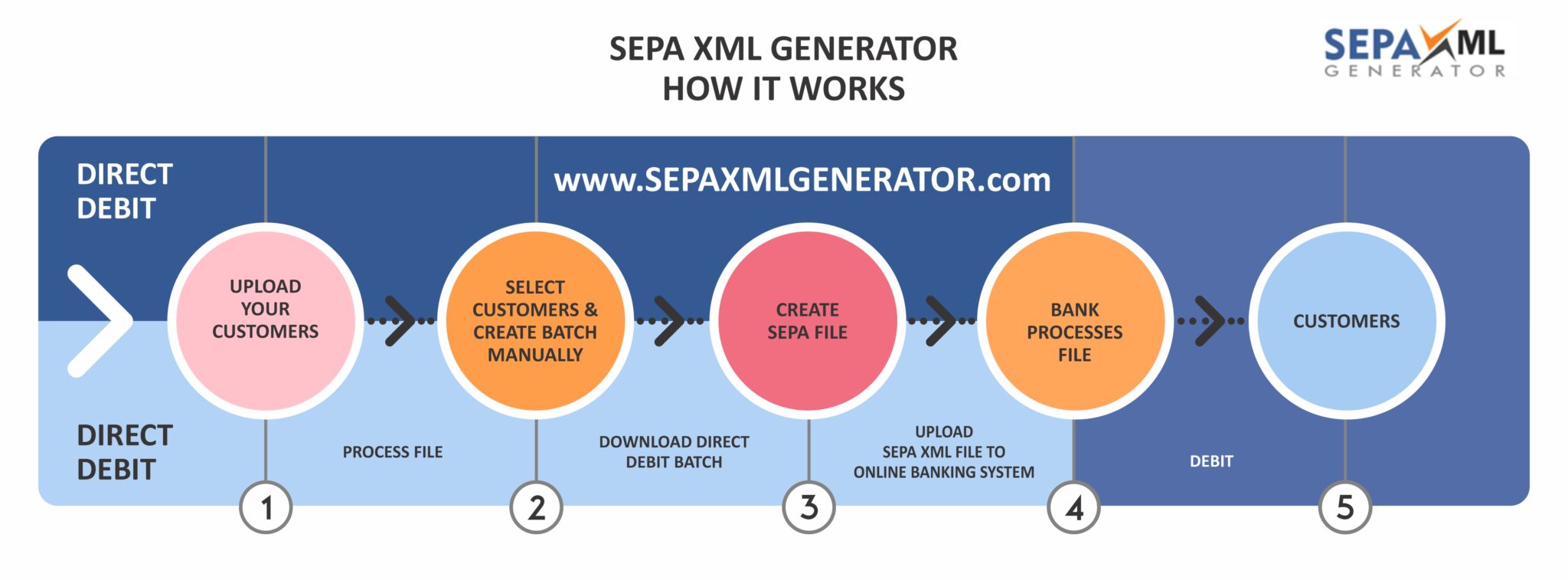
SEPA Process Flow – SEPA XML GENERATOR Application
Project Plan
In order to add structure to the project and keep within time-frames, it was agreed to set milestones for the project. A rough Project Plan was documented and then a Gantt Cart was composed which included duration’s, activities, outcomes and who will deliver on each activity.
Rough Project Plan Schedule
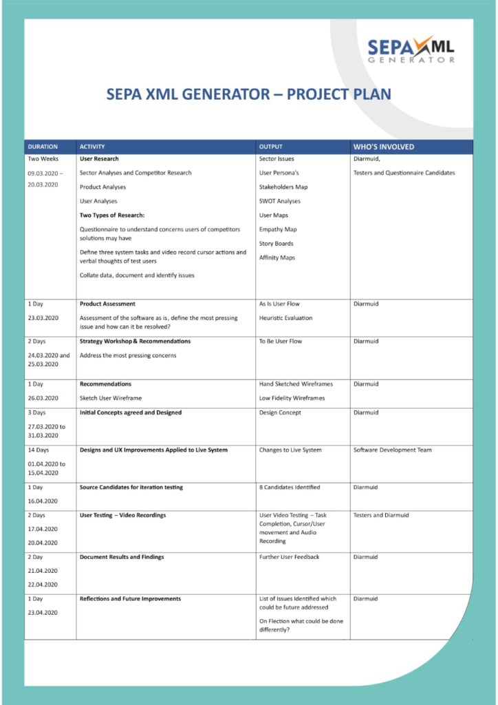
SEPA XML GENERATOR – UX Project Plan with Status SEPA XML GENERATOR – UX Project Plan

(Appendix 15 in .pdf)
The Perceived Problem
The Application is relatively new to the market, untried by any commercial users and thus the initial user research and analyses focused on identifying and addressing the most pressing concerns that the Application had.
In order to better understand the personas of potential users, a generic analyses of the potential target market was considered, essentially who did the Application target from a business perspective?
The software target audience is typically:
- Small Business Owners with 1 to 10 staff members and in some cases up to 50 employees
- Entrepreneurs and Start Up businesses with recurring revenue customers
- Target Geographic: European States which are under the SEPA Umbrella
- End Users: Business Owners, Administration or Finance Staff
- User Environment: Office and Desk Based using Desktop type PC’s
Now that users groups and the type of company were documented, to obtain and garner an understanding of current user experience within the marketplace, a quantitative analysis was undertaken through the medium of a questionnaire.
This questionnaire targeted current users of competitor products, in order to help develop user persona and identify functionality which may be missing from the Application. Discovering users’ needs and requirements and leading to product improvement and ultimately a positive user experience.
Market and Customer Research through a Questionnaire
The questionnaire (Appendix 1, external link to questionnaire) was able to affirm the importance of issues such as Security and Backups. Deleting old xml files from the system would be considered important and a factor which could improve security.
From a user experience perspective, for these busy professionals, aesthetics was of little importance, however, user guides and information popups were considered very helpful. The findings of the questionnaire can be found in Appendix 2.
Key Findings from Questionnaire User Research
Functionality:
- System backups were considered important
- Security was a priority and Deleting Old XML Files was considered a security improvement
User Experience:
- System Aesthetics was of little importance
- User Guides and Information Popups considered very helpful
Competitor User Design:
The questionnaire also produced a list of some comparable competitors which provided an opportunity to analyse competitors back end user experience and system design (it was unethically to gain access to these systems, without deceit and many GMB B2B Reviews are predominantly positive for the competitors within this sector). Competitors solutions were not cloud based, but installed locally and remotely on local desktops and run off customised Database Software, this could relate to security of cloud based solution or a lack of investment in their offerings.
Competitor back-ends interfaces:
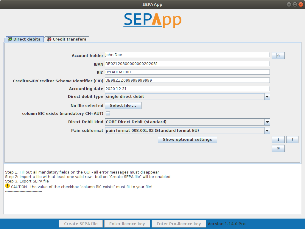
- SEPAPP Customer Dashboard
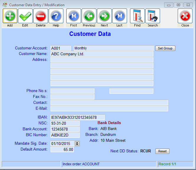
- SepaDirectDebit.ie – Dashboard
- Mercury Software – Adding a New Customer
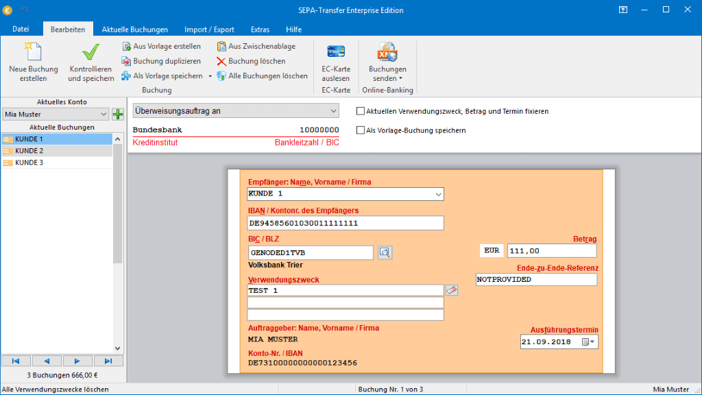
- Jam Software – German Company – Adding a Company Interface
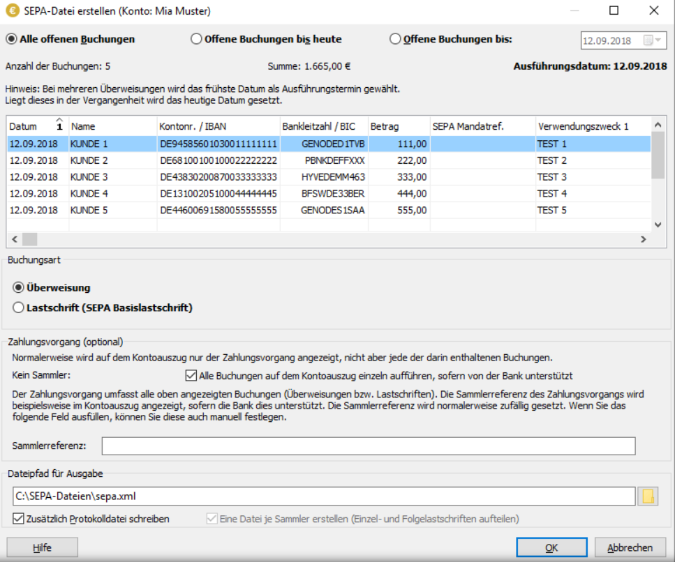
- Jam Software – Generating an xml File
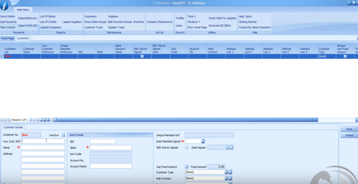
- EazyEFT – Adding a Customer
*It should be noted, due to the narrow use of SEPA XML software, it was difficult to source high level testing candidates, who either used or currently use this type of software. The sensitive nature of the subject area (customer bank account details) also turned some potential respondents off completing the survey. Only eleven candidates completed the questionnaire – however all respondents had used or currently use an SEPA Generator tool or were qualified Accountants with sector knowledge – test subjects were strategically targeted and verbally approached.
Usability Testing – 3 Tasks, Recorded and Think-Aloud Feedback
The qualitative research provided a generic overview of the user requirements from a functional perspective. However, to discover a rich understanding of the Application itself, it was necessary to undertake end user testing of the Application in the form of Usability Testing. Usability testing involves asking potential or current users of a product or service to complete a set of tasks and then observing their behavior to determine the usability of the product or service (Maler, 2010).
This usability testing was locally recorded on PC’s by software such as Snagit or Nimbus with the primary purpose of capturing cursor movement, time to complete tasks and if the SEPA xml file was generated successfully. The candidates were also asked to verbalise their thought process while completing three tasks, a ‘think-aloud protocol’ (Neilson, 2012). These unmoderated tests were ideal due to the uncomplicated nature of the software and the specifically defined tasks presented. Any help and assistance required to complete the task where not required and any recorded confusion reinforced the issues the software has.
Think-Aloud Protocol was ideal for this user testing, as it allowed for flexibility for the user to undertake the test, it was cheap and ideal for testing a software application (Neilson, 2012). It also provided possible solution ideas from the testers, as if in a group brainstorming session. Such as:
‘Does the Debit amount need two digits or 4 digits with a dot? I’m not sure?’
The downside within this research is that it distorts the natural timing to complete tasks.
Six candidates were involved in the initial Application testing.
The video below is a demonstration of the Application in use by an experienced user, who has an in-depth knowledge of the system:
This video was removed Privacy reasons.
Recorded User Testing and Commentary
A user testing brief was prepared (Appendix 3), which contained three key user steps within the Application and an introduction to the application, these tasks included:
- Setup a Company
- Add a Customer
- And Generate an SEPA xml file for that Customer
The test recordings links can be found in Appendix 4. The primary findings and problems identified included, one key pain point, which was Adding a Customer with a Direct Debit amount. Of the 6 tests completed, no users managed to generate a successful SEPA xml file with correct customer details. The files would fail if submitted to online banking systems.
The confusion related to an over complication on the part of the Application around Adding Customers and Adding Customer Direct Debit Amounts, see:
This video was removed Privacy reasons.
If this issue is not addressed, fundamentally, the software fails to deliver on it’s fundamental promise, which is to generate SEPA compliant XML Files. This is the reason this particular issue was chosen for immediate resolution and became the focus of this project.
The problem was generating a successful SEPA xml fille.
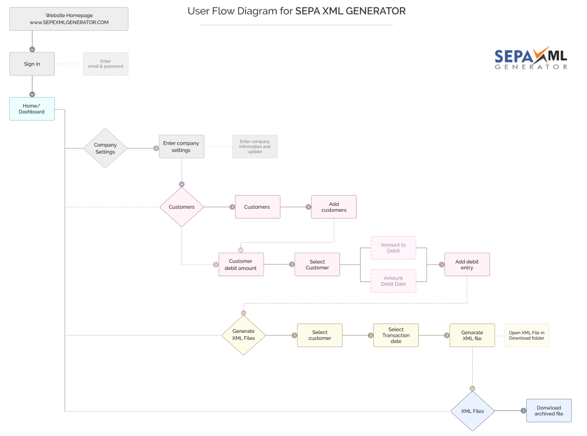
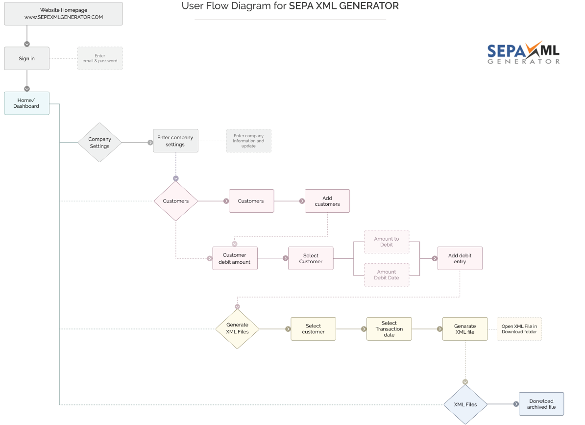
An over complicated AS IS User Flow – The Current AS IS user flow
Documenting and visualising the AS IS User Flow (using Figma) allowed for an objective view of the current complexity and user confusion of the steps. Could steps be merged or removed while not interfering with the technical format of the xml file generated?
AS IS USER FLOW – SEPA XML GENERATOR
(Appendix 4 in .pdf)

Other Pain Points and Observations Taken from the video user research included:
The average completion time for the testers was: 11 minutes and 53 seconds
‘No Home Link/Button’
‘My Company Settings as opposed to ‘Company Settings’’
‘I’d like to see my company logo’
‘No + icon to Add Customers’
‘The Date Calendar pops up over the question’
‘Contextual Help would be handy – not sure what ‘xxx’ means’
‘Make last payment, can’t be unselected’
‘Validating a mobile number, ‘Mobile number must contain an integer without any whitespace’ – what does this mean? This should be in plain English.’
‘Not sure what Client Narrative is?’
‘Does the Debit amount need two digits or 4 digits with a dot? I’m not sure?’
‘What does Deactivate mean on Customer Status?’
‘What does Make Last Payment mean?’
‘Why is there a restriction on the phone number digits?’
‘Did the file download? Would have been nice to get a pop up notification?’
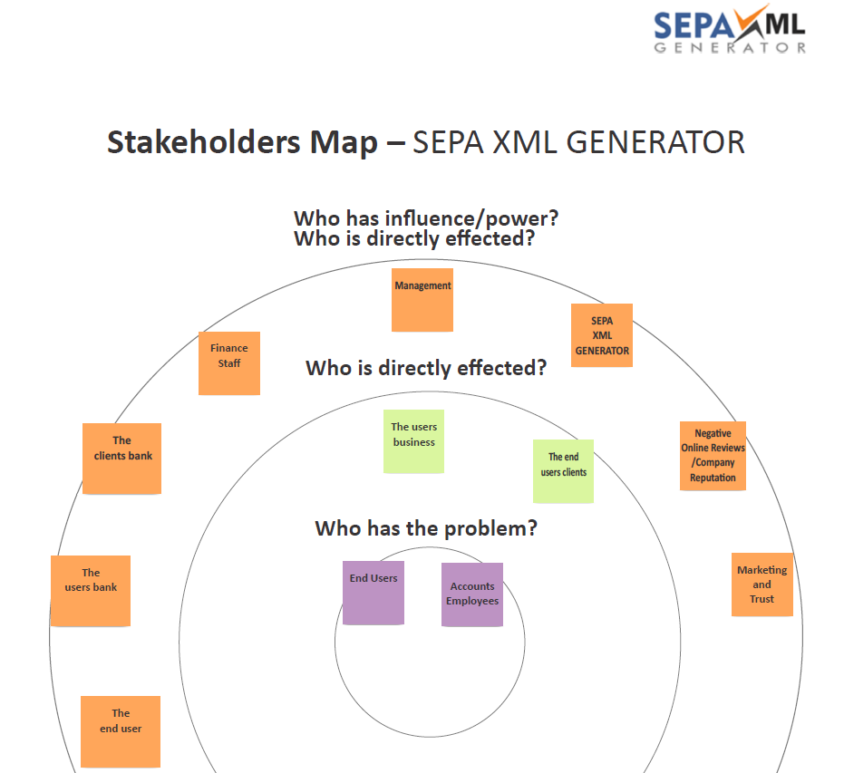
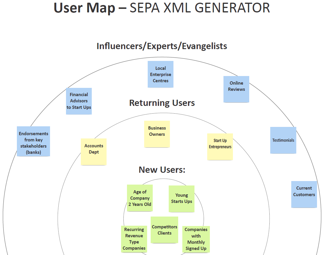
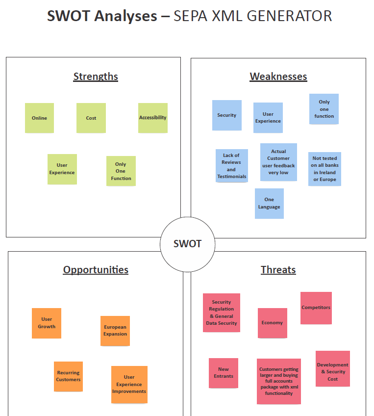
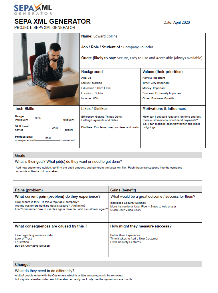
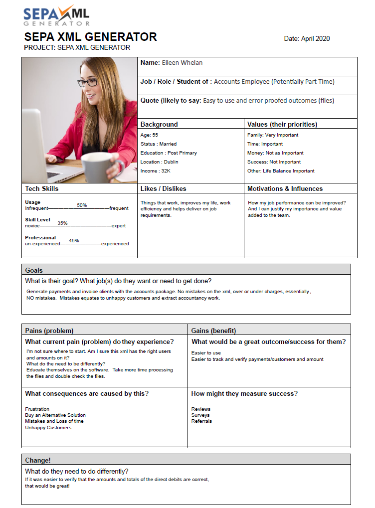
It was clear the current Application needed fundamental user flow re-engineering, however, before an TO BE user flow is brainstormed, a deeper appreciation of the market, the sector, users and the current software was undertaken using a number of user experience methodologies. Firstly, delving into the sector using Stakeholders and Influencers Maps, a SWOT Analyse, Affinity Mapping and then comprising two user persona’s developed for two key Application users, an Entrepreneur and an Accounts staff member within a small company.
A Stakeholder Map – SEPA XML GENERATOR
(Appendix 6 in .pdf)
Target User Map – SEPA XML GENERATOR
(Appendix 7 in .pdf)
A SWOT Analyses – SEPA XML GENERATOR
(Appendix 8 in .pdf)
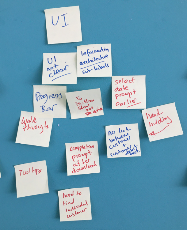
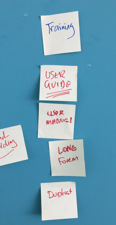
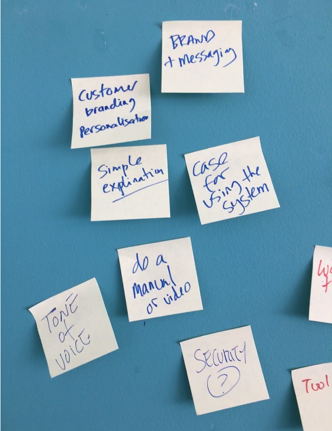
Affinity Mapping – SEPA XML GENERATOR
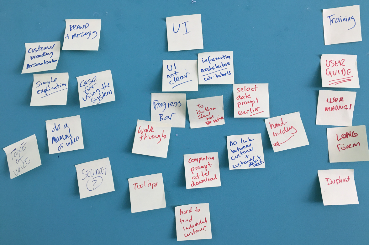
Overview
Affinity Mapping – Groupings
- User Interface
- Training and Education
- Branding and Message
User Persona’s – SEPA XML GENERATOR
Persona 1 – Company Founder
(Appendix 9 in .pdf)
Persona 2 – Account Employee
(Appendix 10 in .pdf)
User Storyboard
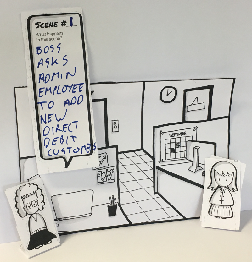
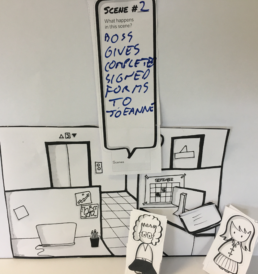
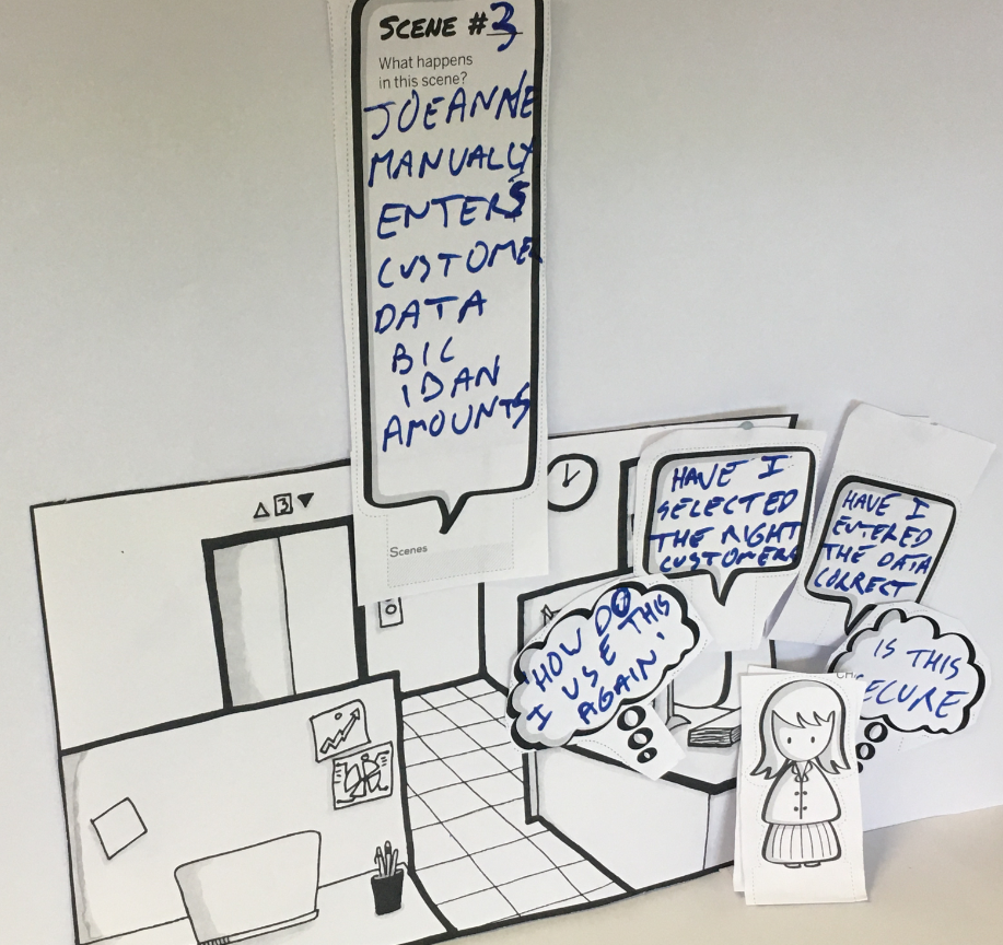
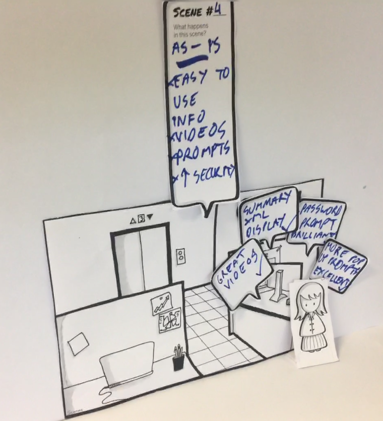
The context environment that an Admin staff might use the software was represented by a ‘User Storyboard’.
- Storyboard – Accounts Employee – Scene 1
- Storyboard – Accounts Employee – Scene 2
- Storyboard – Accounts Employee – Scene 3
- Storyboard – Accounts Employee – Scene 4
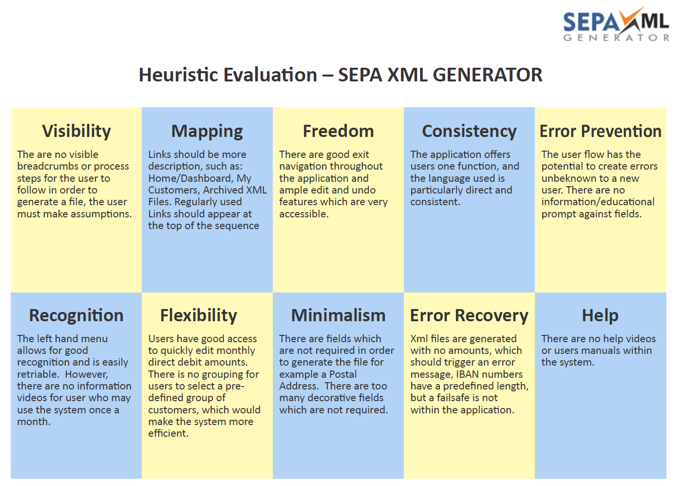
AS IS Heuristic Evaluation
Analysing the Application by using An Heuristic Evaluation of the Current Application also helped to identify possible problems.
(Appendix 11 in .pdf)
TO BE User Flow – The Primary Issue
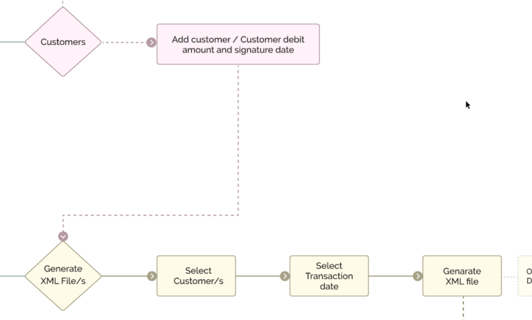
The fundamental issue this design project will try to address is the 100% failure rate to generate a successful SEPA XML file based on the initial user research. Analysing the User Testing Videos pointed to confusing surrounding the added step of applying a debit amount for a second time after a customer has already been added with a debit amount in the Add Customer step, a confusing double entry, as explained in this video:
This video was removed Privacy reasons.
TO BE User Flow – Potential Solution
(Appendix 12 in .pdf)
The suggested TO BE User Flow eliminated potentially 5 user steps, 5 steps which appeared to confuse the user. The TO BE User Flow consisted of:
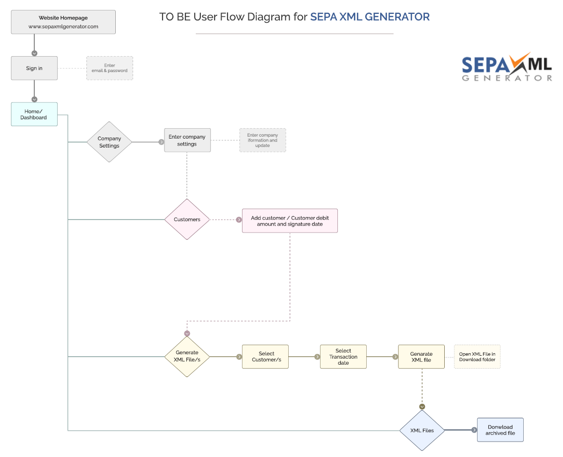
Side By Side User Flow Analyses – AS IS versus TO BE
Analysing the AS IS User Flow:
The Goal of the AS IS Analyses was to reduce the number of steps and thus reduce the potential for errors. By coupling the Add Customer and Add Customer Debit into the same step removed 5 steps from the flow, specifically:
- User Flow – AS IS Primary Issue Identified
- User Flow – TO BE – Removing Unnecessary User Steps
This entire row of steps were removed from the user flow AS IS:

User Flow – AS IS Primary Issue Identified – Steps to be removed
The next phase in the project was to comprise Wireframes (using Adobe XD) which started off with hand drawn sketches of the main confusion and pain points raised in the questionnaire, the verbal comments in the video testing and the critical user flow issue.
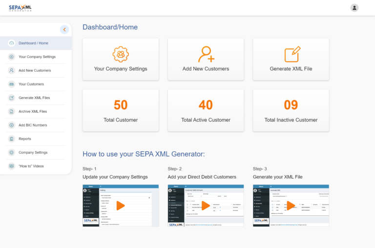
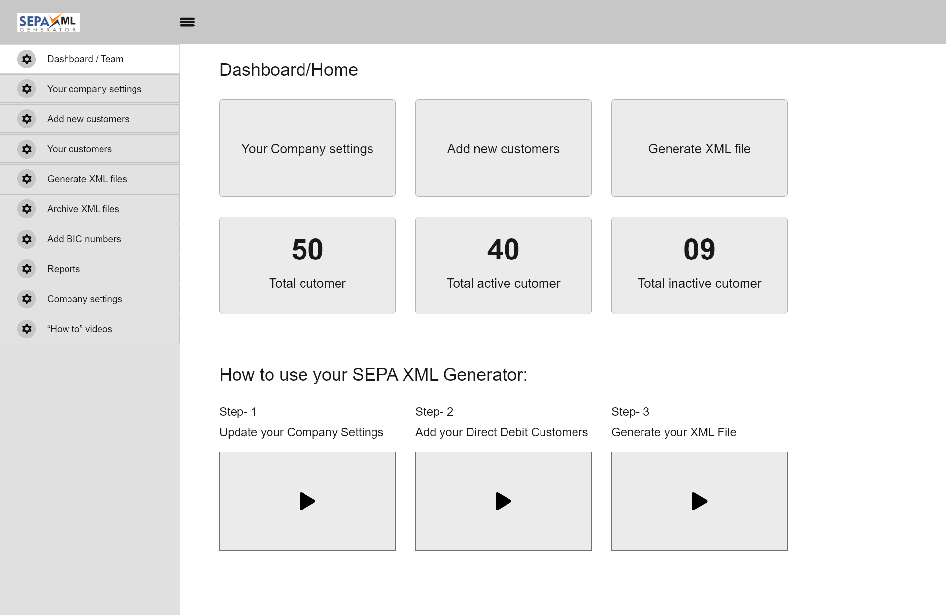
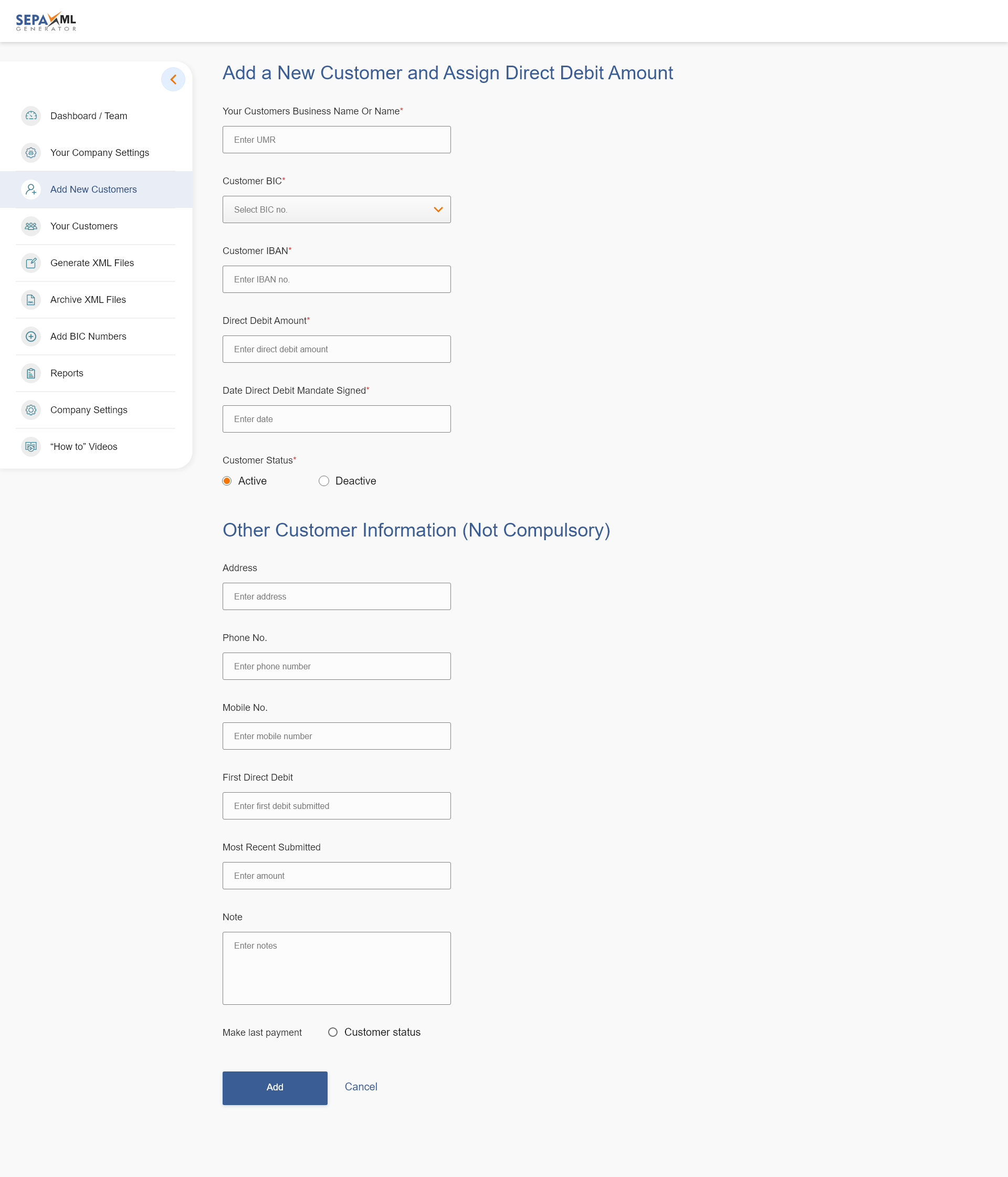
Wireframes for the Dashboard and the Add Customer Step
The issues identified and solutions considered were:
1
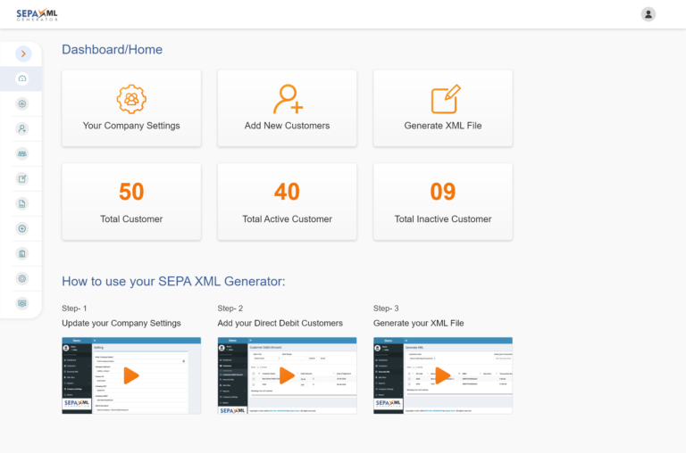
Embedding the primary three Application functions into the Dashboard – above the fold and in sequence of required use:
1: Company Settings 2: Adding a new Customer 3: Generating an XML File
2
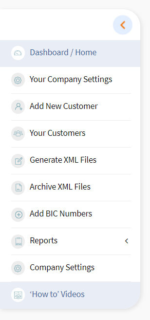
Changing the Sequence of Links on the left hand menu and demoting non essential links and renaming some, making them more descriptive – addressing as many user testing concerns as possible, such as:
‘No Home Link/Button’
3
Embedding User Videos onto the Dashboard and inserting a new link on the left hand side: “How to” video
 4
4
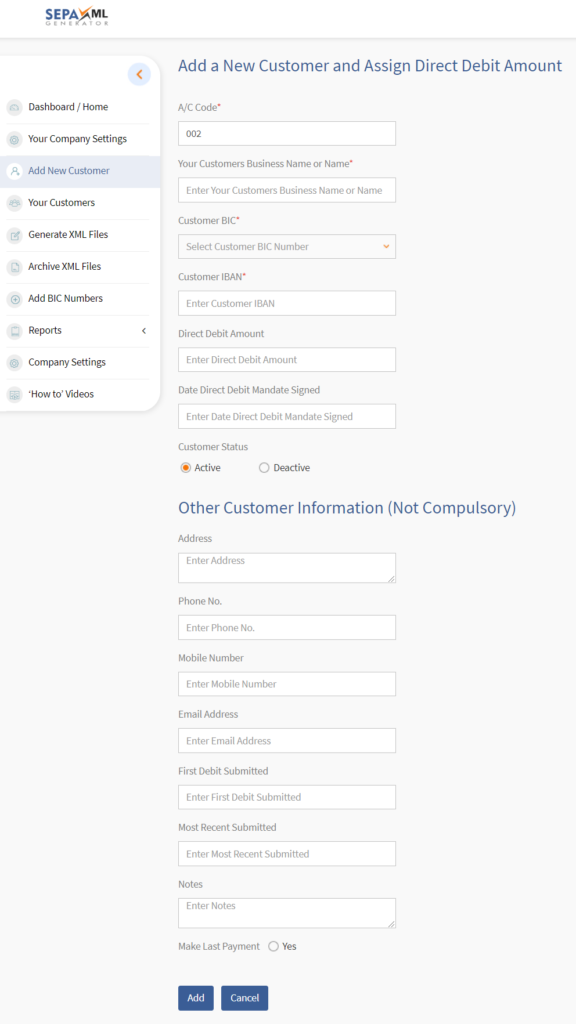
In order to address the Adding a Customer form and simplifying the process flow, all fields were merged onto one step and the form was broken into two sections, Compulsory Fields (required to generate a successful SEPA xml file) and non-compulsory fields, used for record keeping.
5
Although aesthetics was considering not very important from initial research, it was agreed to improve the look and feel of the application in order to improve usability, increase trust and potential product endorsements.
High Fidelity Designs were composed in Adobe XD:
User Dashboard-Home – The Screenshots below can be found here on XD: https://adobe.ly/34Pga6x
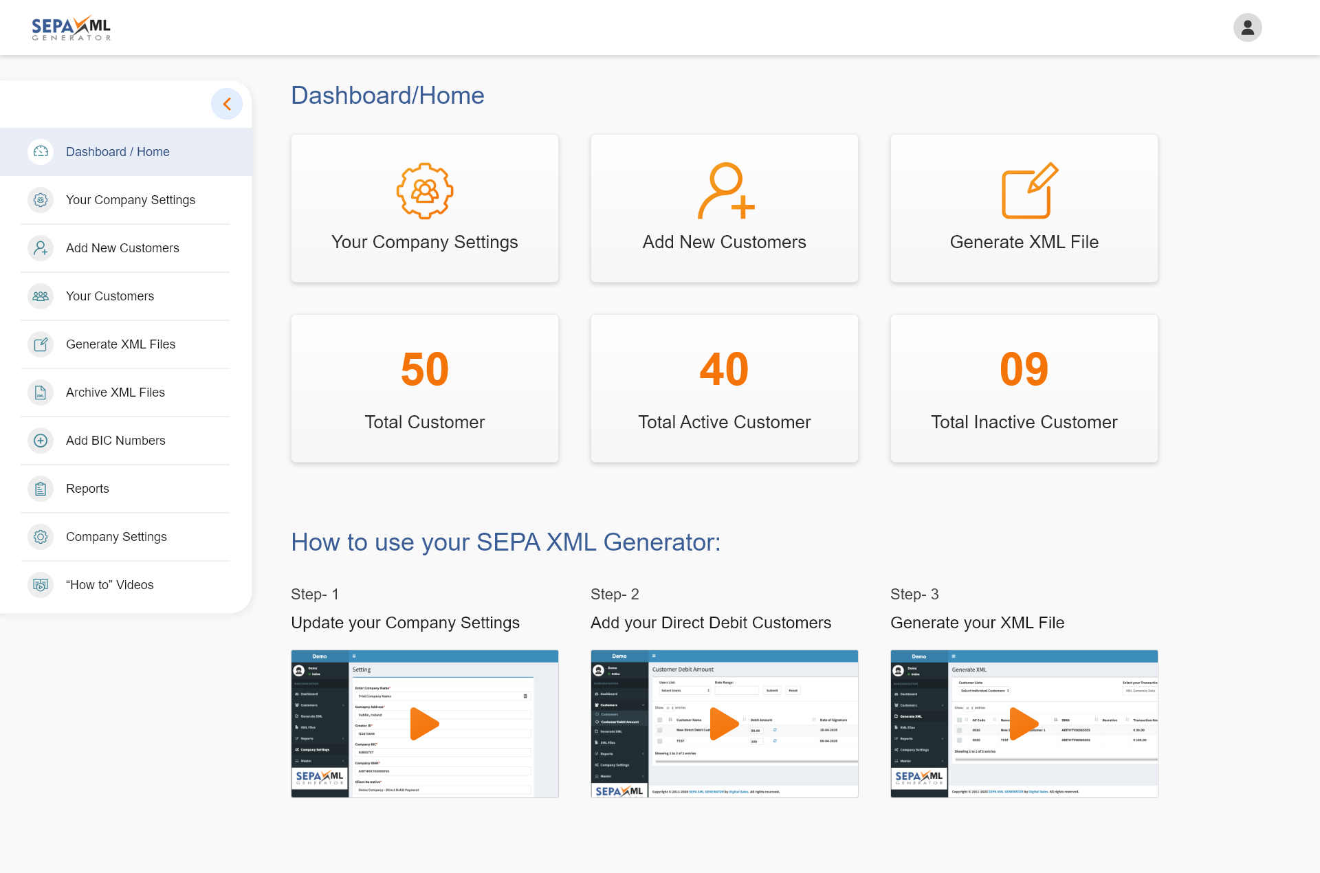
Dashboard-Home Full Menu – SEPA XML GENERATOR
Adding a New Customer
 A Pop Up was also designed so users can directly go to the Generate an XML file step once a customer was added, and informing the user that the customer was updated successfully. The High Fidelity Digital Prototype was captured in video format:
This video was removed Privacy reasons.
Under normal circumstances the High Fidelity Prototype would be user tested prior to the design and process changes passing over to the software development team. However, the application has no live commercial customers and the coding expense was minimal, the decision was made to apply the changes to the live system and then undertake user testing on the first Iteration of the Application.
Usability Testing – 1st Iteration – Video User Flow – Completing 3 Tasks
This video was removed Privacy reasons.
Before the 1st Iteration and UX Process and Design Changes Applied:
This video was removed Privacy reasons.
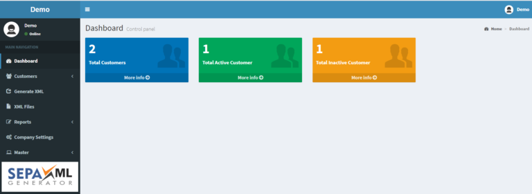
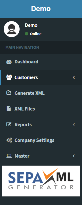
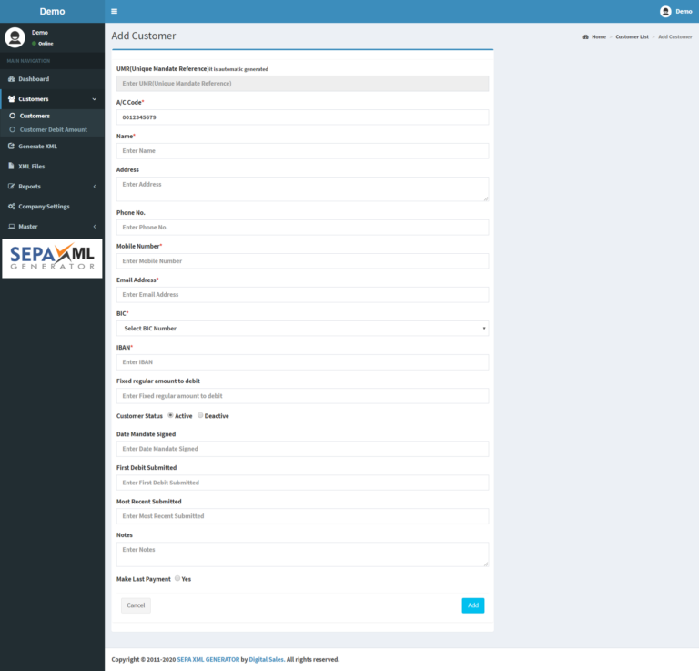
Comparing Interfaces – Initial and Iteration 1
Dashbord/Home
Left Hand Menu
Adding a New Customer Page
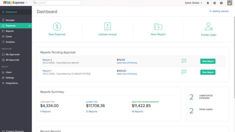
Comparing a B2B Backend Dashboard – ZOHO CRM with SEPA XML GENERATOR
- ZOHO Dashboard
- Dashboard-Home Short Menu – SEPA XML GENERATOR
Usability Testing and Results – 1st Iteration
The conditions of the user testing remained the same as the initial testing, three functional tasks to complete but with nine candidates. Four of the nine candidates also completed the first test and the users were also asked to verbalise their thoughts throughout the process. The average completion of the three tasks reduced to 6 min 74 second average. Familiarity of the system, auto-fill and the reduced steps in the process were most likely related to a reduced average completion time of 11 minutes and 53 seconds from the initial test.
The problem at the outset was to ensure that the primary function of the software performed, and of the 9 completed tests on Iteration 1 of the Application, the successfully generation of a SEPA xml file was 100%. The new user flow achieved it purpose and solved the core problem identified from the initial testing. The solution has been validated.
Future Iterations and Changes Applied
Now that the primary user issue is resolved, some of the observations and issues noted by testers could be addressed in future iterations.
‘Why is there a restriction on the phone number digits?’
Regarding Microcopy and contextual help, sector type terminology would need to be explained for the type of persona’s who are not professionally trained accountants, for example:
‘Contextual Help would be handy – not sure what ‘Debit Narrative’ means’
‘What does Make Last Payment mean?’
Make the Application more personalised, embedding the ability to upload a User Image or company logo into a Profile image and embed the company logo into the design, addressing some comments such as:
‘I’d like to see my company logo’
Some testers were unsure if the xml file was in fact downloaded, a Popup notification would also be a for informative improvement for the user. ‘Your SEPA xml file has been successfully generated, see your Download folder or the ‘Archive XML Files’ link on your Left Hand Menu’
‘I think it downloaded, ah, I see it here’
Other Reflective Consideration and Potential User Improvements:
Videos on the Dashboard
On reflection, the position of the three videos on the dashboard of Iteration 1 overcrowds and makes a relatively straight forward function feel complicated and daunting to the user. A future iteration would trial removing the videos from the Dashboard and inserting bullet point user notes.
Company Settings
The Company Settings link on the top of the left-hand menu could be removed and when the user logs in for the first time they are forced to complete that form. Or every time the user signs in and that form is not completed a popup notification will appear. Or a red text error message could appear on the Dashboard letting them know they must populate the Company Settings in order to Add Customers and Generate an xml file.
Trust and Credibility
Sector Accreditation
Considering the sensitive nature of data captured, to offset trust issues, the company should investigate gaining sector recognition from third party bodies such as:
- BACS Approved Bureau
- ISO IEC 27001 2013
Some cloud based competitors have such accreditation
Reviews, Case Studies and Testimonials
Increasing the number of online reviews on sites such as: Trust Pilot, GMB and consider comprising Customer Case Studies and Testimonials – which would increase consumer trust.
Reflective Consideration – The Project Plan and an Incremental Approach to User Experience
Wisely, the project focused on one particular Pain Point, the most CRITICAL, if other process flow issues such as adding BIC numbers or selecting more than one customer were addressed in this particular project, it may have led to an over complication of the process. A stepping stone approach really suited this project.
The Project Plan generated in Excel enforced good structure on the project, which is updated below with the STATUS column populated.

(Appendix 16 in .pdf)
The ideas and analyses of the Application in a group class environment was an extremely valuable exercise, different minds with different outlooks opened up areas of user consideration which I may have missed. This was invaluable at the start of the project however working in a team throughout the entire project could have helped maintain this type of grouped learning. The project was individual based and the Covid-19 issues also curtailed the prospect of meeting as a group in class.
Finally, the exponential learning from this project related to the stitching together of all the facets of Human-Centred Design. From initial research, sector and persona analyses, heuristic evaluation, testing, feedback, wire-frames, iterations, etc. adhering to the structured steps of a User Experience project was an invaluable take away from a personal learning perspective and one which ultimately delivered. The proof is in the 100% testing feedback, 9 out of 9 users successfully generated an SEPA XML from a base of ZERO!
In essence, applying all that structured academic theory and turning it into successful practice. “There’s nothing so practical as a good theory” (Lewin, 1951).
References
Lewin, K. (1951). ‘Field theory in social science; selected theoretical papers’. D. Cartwright (ed.). New York: Harper & Row. (p169)
Maler, A. (2010, June 1). Complete Beginner’s Guide to Design Research. Retrieved April 28, 2020, from www.uxbooth.com/articles/complete-beginners-guide-to-design-research
Neilson, J. (2012, January 15). Thinking Aloud: The #1 Usability Tool, Retrieved April 28, 2020, from https://www.nngroup.com/articles/thinking-aloud-the-1-usability-tool/
Appendices
Appendix 1: Quantitative Research – SEPA XML GENERATOR – Questionnaire
Appendix 2: Questionnaire Results – SEPA XML GENERATOR
Appendix 3: Instructions for Testers SEPA XML GENERATOR
Appendix 4: Initial User Testing Video Links – Application AS IS March 2020:
SEPhttps://www.digitalsales.ie/digital-blog/wp-content/uploads/2020/04/Instructions-for-Testers-SEPA-XML-GENERATOR.pdfA XML GENERATOR – Trial 6 – April 2020 – https://youtu.be/xMkhJcn5QAc – Duration: 10.58
SEPA XML GENERATOR – Trial 5 – April 2020 – https://youtu.be/2KHFvWsNWX8 – Duration: 15.04
SEPA XML GENERATOR – Trial 4 – April 2020 – https://youtu.be/39YBP8Q5gCY – Duration: 5.00
SEPA XML GENERATOR – Trial 3 – April 2020 – https://youtu.be/liPjHLhlKNc – Duration: 9.10
SEPA XML GENERATOR – Trial 2 – April 2020 – https://youtu.be/uXvw5QmWoow – Duration: 20.32
SEPA XML GENERATOR – Trial 1 – April 2020 – https://youtu.be/ipahDiYaado – Duration: 9.16
Appendix 5: AS IS – USER FLOW – SEPA XML GENERATOR
Appendix 6: Stakeholder Map – SEPA XML GENERATOR
Appendix 7: Target User Map – SEPA XML GENERATOR
Appendix 8: SWOT Analyses – SEPA XML GENERATOR
Appendix 9: Personal User – SEPA XML GENERATOR – Company Founder
Appendix 10: Personal User – SEPA XML GENERATOR – Accounts Employee
Appendix 11: Heuristic Evaluation – SEPA XML GENERATOR
Appendix 12: User Flow – TO BE – SEPA XML GENERATOR
Appendix 13: User Testing 1st Iteration – Video Links:
SEPA XML GENERATOR – Trial 1 – Iteration 1 – April 2020 – https://youtu.be/Kj14pNCzDuY – Duration: 5.23
SEPA XML GENERATOR – Trial 2 – Iteration 1 – April 2020 – https://youtu.be/-2222qjc-_0 – Duration: 7.11
SEPA XML GENERATOR – Trial 3 – Iteration 1 – April 2020 – https://youtu.be/ApovVwODzDs – Duration: 6.36
SEPA XML GENERATOR – Trial 4 – Iteration 1 – April 2020 – https://youtu.be/fN48aqg-cwk – Duration: 7.22
SEPA XML GENERATOR – Trial 5 – Iteration 1 – April 2020 – https://youtu.be/OgjVRi2eYQ0 – Duration 5.42
SEPA XML GENERATOR – Trial 6 – Iteration 1 – April 2020 – https://youtu.be/8-TDw8XEjaw – Duration: 8.14
SEPA XML GENERATOR – Trial 7 – Iteration 1 – April 2020 – https://youtu.be/mxY8UDH4SEI – Duration: 10.38
SEPA XML GENERATOR – Trial 8 – Iteration 1 – April 2020 – https://youtu.be/_-4r9UzI7Hw – Duration: 7.26
SEPA XML GENERATOR – Trial 9 – Iteration 1 – April 2020 – https://youtu.be/zWL3bvJJIRQ – Duration: 3.55
Appendix 14: Presentation – SEPA XML GENERATOR – Class Presentation 24.04.2020
Appendix 15: SEPA XML GENERATOR – UX Project Plan
Appendix 16: SEPA XML GENERATOR – UX Project Plan with Status
Comments are closed.

