
Collect and Examine Information…User Experience – Human-Centred Design
Introduction – Collect and Examine Information…User Experience – Human-Centred Design
This Blog Post follows on from the initial user analyses of the Bus Eireann School Transport website, based on Neilson’s (1994) heuristic evaluation. This analyses can be found here: https://www.digitalsales.ie/digital-blog/user-experience-analyses/
The next stage within this Human Centred Design project is to collect and examine information in order to empathise with users and identify their needs and possible scenarios of use for the School Transport website.
User Personas
Before a deep analysis of the website is undertaken, we must try and understand who the website users are, what are their pain points in their own environment and empathise with users. We must create User Persona’s for two potential users, which should result in a more focused and consistent outcome/website for the Bus Eireann users.
Persona 1 – Aoife D – Mother of 3 – 40 Years of Age
User Empathy Map
Journey Phases
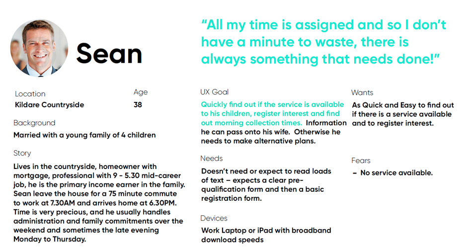
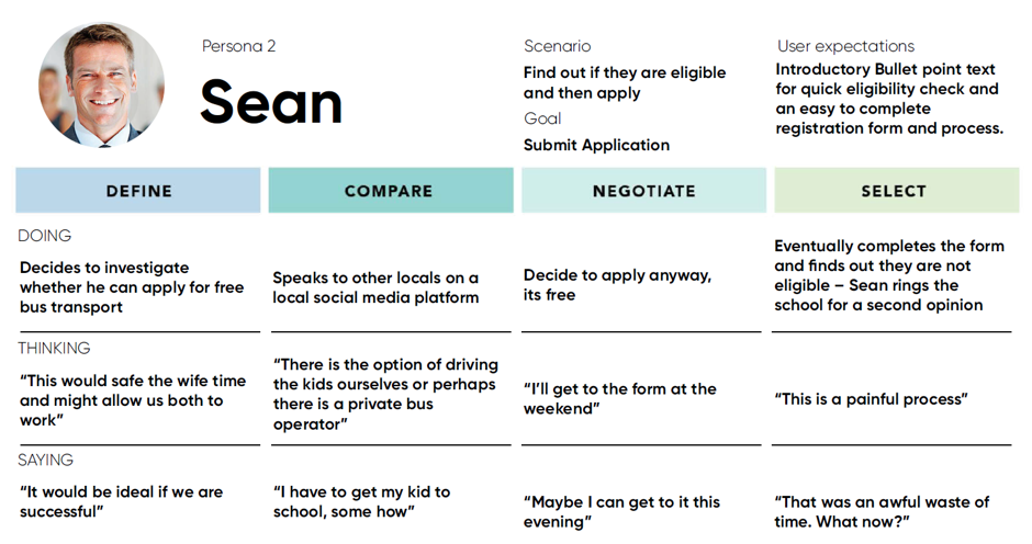
Persona 2 – Sean – Father of Post Primary Children of 3 – Age 38
Journey Phases
Now that personas were attached to the user experience, the next step is to undertake low-level user research as to the School Bus Application process, confirming or denying the initial heuristic analyses produced in the first blog post.
Initial Usability UX Testing
The initial research was carried out remotely and the candidates were asked to use the primary registration link at the starting point: https://www.buseireann.ie/inner.php?id=257.
Each candidate was asked if the School Bus system related to them and if they may avail of the service at present or in the future. Five parents living in Dublin/Wicklow and Kildare, with children between the range of 6 and 14 years of age, were asked to complete two tasks within the process:
- Register on the Site
- Make an Application
Upon completion of the process and tasks above candidates were each asked four questions (a link to the full questionnaire and the results of the survey can be found in Appendix 1). The survey was broken into two tasks, Registration and the Application.
Age
Gender
Number of Children
Device used: Mobile/Tablet/Desktop
Did the process go smoothly? Y/N
Have you encountered any problems? If so, please list.
From 1 to 5 how would you rate your overall experience. Please circle the number, 1 = really bad, 5 = excellent – Comments
What would you change in the registration process?
Research Questionnaire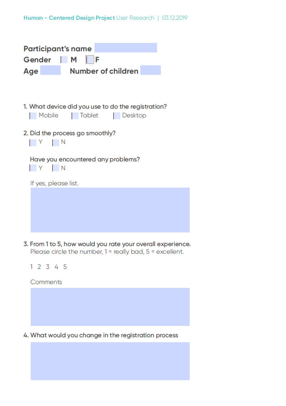 Comment & Findings
80% of respondents encountered problems and 100% of recommended changes to the process. It was clear from this sample of highly targeted users that the website has serious usability issues. Comments included:
‘The Website Design looked Dated’
‘The Registration was fine but very old fashioned – the registration email went to my Promotions tab in gmail’
‘I didn’t quite understand what I was doing and where I was going – there were no signposts’
‘I wasn’t eligible and it would have helped if I could have ruled myself out very quickly’
‘There was way too much text on the site, way too hard to read and follow’
Now, that a strong assumed Persona for the website is established and website users have clearly identified user experience and design issues, we now undertake an analyses of similar transport type websites in order to evaluate live best practice.
Competitor Analyses

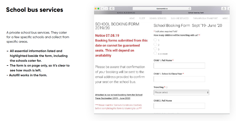
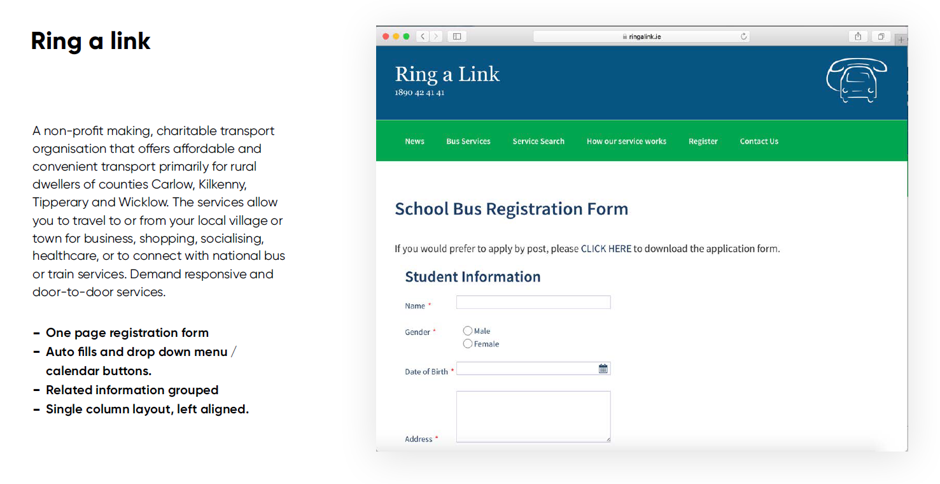
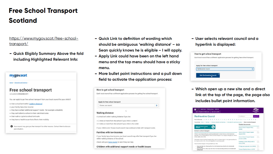
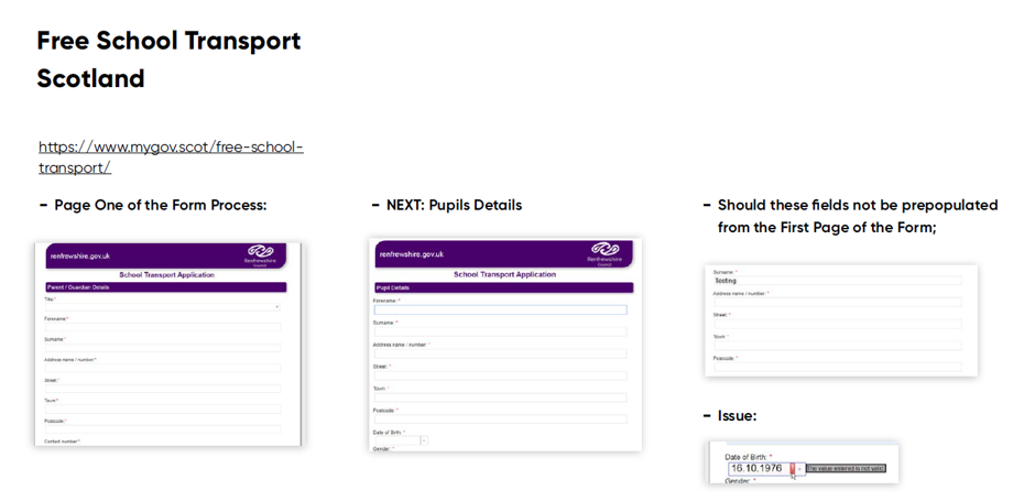
Indirect Competition
Step Two
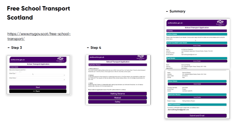
Step Three
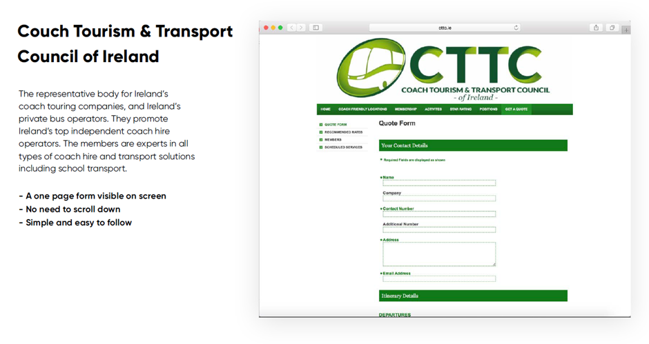
A Simple User Registration Form – UX – Two Steps
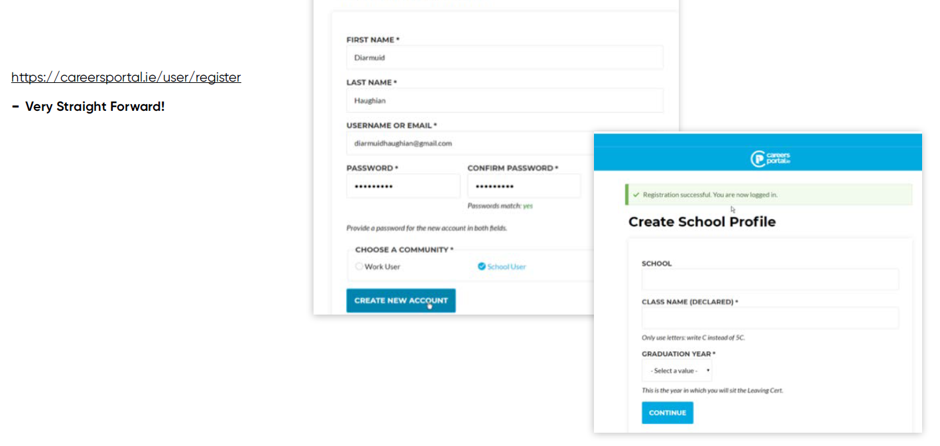
The competitive analyses clearly provides ‘food for thought’ and examples of similar websites which successfully employ some of the heuristic principles of user design.
Summary
There are significant issues with the current user experience and design. However, now that two persona’s like Sean and Aoife have been developed, empathy established and users goals have been identified. Alternative process flow and user designs can be trialed and tested. Taking influence from competitor websites and applying Neilson’s (1994) heuristic design principles.
Appendix 1
References
Nielsen J. (1994) Usability Engineering, Morgan Kaufmann Publishers Inc.
Related Posts:


Comments are closed.