


This blog details an appraisal of the website which processes School Bus Applications for Primary and Post Primary students throughout Ireland on the Bus Eireann website, assuming the following url as a Parent/Student application starting point: https://www.buseireann.ie/inner.php?id=257
The initial appraisal will begin with an assessment of the usability and the user experience (UX) goal based on Nielsen’s (1994) best practice usability heuristics and design practices.
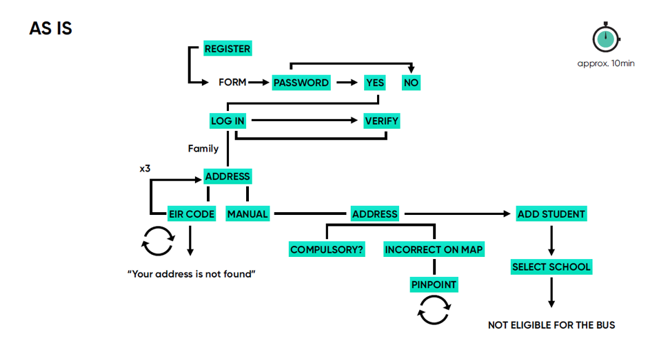
Scenario: The fundamental objective of this examination is to register and apply a child for consideration for free school transport through the Bus Eireann website. There are a number of potential end user outcomes, such as: Not Eligible, Eligible/Apply, Appeal – this documented testing resulted in an Eligible/Apply outcome. Further analyses are required in order to survey all potential outcomes and user flows.
Appendix One contains a detailed user flow analyses in screenshot user flow (which can be found here), however, the holistically the UX and design analyses will be dissected against Nielsen’s ten general principle of interactive design.
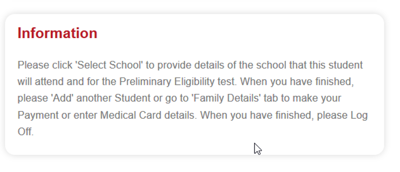
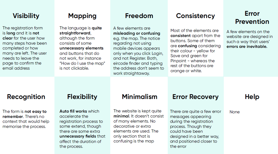
This facet of heuristic evaluation fundamentally relates to communications, acknowledgment and application status – how is the application proceeding and what steps does a user have to take. Is there open communication between the user and the system?
Analyses:
From the onset there is little instruction as the steps involved for the user, but a non-descript Register button. Before the user registers what can the user expect? It may be obvious to most, but why is the system asking the user to find an exact user address? Communication is poor and there are no breadcrumbs or steps on display to let the user know how their application is progressing and the steps they need to complete. For example:
Register > Find Your Address > Add a Student > Find Your School > Apply > Payment
Poor.
Does the system speak the language of the user, who is the user and are real world conventions used? What is the user familiarity with regard to the technology in use?
Analyses:
The buttons need to be more descriptive and information in order to inform and empower the user. For example, instead of Save, Save your Address and Add Student
The colours in use on buttons, relate to the Bus Eireann logo and not standard button colours, such as Green when a user should, Select a School:

Poor
Is there good undo, cancel and back functionality on the website and throughout the application process? Allowing the user full control of the application process.
Analyses:
Yes, there is good Cancel, Change and Edit functionality, however, no Back option, or use of Breadcrumbs, allowing the user to step back in the application process from the top navigation section of the page.
Good – However, room for improvement.
Are existing user expectations being met throughout the website? And is the website forcing its users to learn new habits outside the user’s norm?
Analyses:
Yes, however, the user experience is somewhat dated, and the user has to make assumptions as to the next step. Modern UX informs and leads the user to where they want and should go throughout the process.
Average.
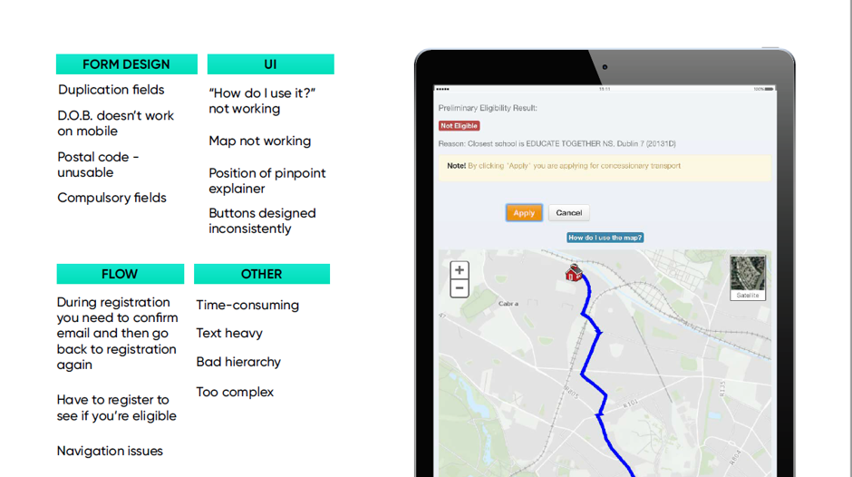
Are there any steps or stages in the application process which may result in errors, but which can be avoided?
Analyses:
The user was dumped out of the application and had to sign back in. The Eircode error can be avoided. The month Calendar functionality failed to display.
The house/address error message, should pop up rather than hidden at the bottom of the screen:
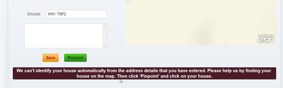
Average, based on the Eligibility status application. Other scenarios and outcomes may unearth other errors.
Are the user steps and usability throughout the application process recognisable? Does the user have to think too much?
Analyses:
The user steps are not clear. The user too often has to make assumptions, for example:
The Search button on the Address step within the process:

When the address has been successfully been accepted by the system, the Search button goes from Search to Save:

Save – but what does the user do next? The user might not even realise the button has changed from Search to Save.
Poor
Are there any ways which the application process can be improved, in terms of reducing duplication? Are there any accelerator potential?
Analyses:
Duplication was not an issue, however, in order to accelerate the application process, in case a user is ‘not eligible’, then a Quick Eligibility test should be available to the user, before a full registration and application.
Average
Is there too much information on the website and are these messages essential and relevant?
Analyses:
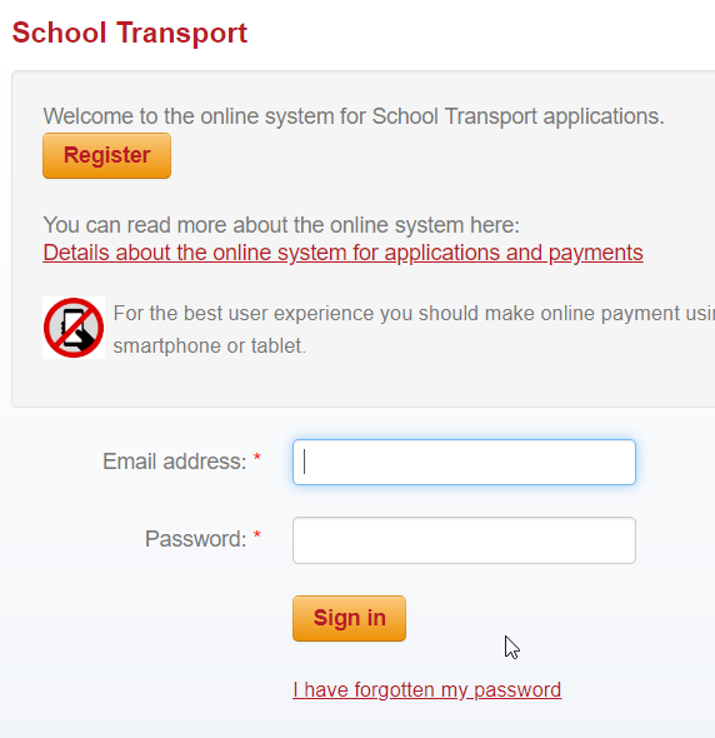
The look and feel of the site is somewhat dated, for example the login page:
The site has too much paragraph text (as opposed to bullet points), such as:
In fact, there is information overload on the landing page, which is 6 screen depth in length.
Poor
When a user makes an error, how clear is it for the user and how does the user address these errors and recover from it?
Analyses:
The serious form of dissatisfaction is assigning the uses Address to the application – it needs to be simplified and the error messages and guidance are hidden and hard to find.
Poor
Is it easy to search for help? Is there documentation and is the help within focused on the users tasks and steps.
Analyses:
There is a .pdf Help link on the Header, this menu is not a ‘sticky menu’ and the link is very small, which makes it hard to find.
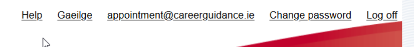
The Guideline links (see below) are only on the landing page, which disappears once the user initiates the Registration process. This ‘help’ must be easier to find and browser based.

There is no Search Functionality on the site – which would assist finding help.
Issue Summary:
Task analyses is a model of visualising and identifying Opportunities to improve the Application and generating ideas to approach the problems. Currently the user application process is as:
The Task Analyses for adding a second child/student is quite clear:
Add Student -> Add Name and DOB -> Save -> Select School
By Default, could the fields be pre-populated with Child One School Details and editable if required, thus avoiding duplication?
Nielsen J. (1994) Usability Engineering, Morgan Kaufmann Publishers Inc.
Link to – User Flow Testing Document:
Screenshots for Bus Eireann Application – Including Issue Identification