
Final UX Prototype Design for Bus Eireann School Transport including a Critical Analyses and Evaluation
In previous blog posts within this series (https://www.digitalsales.ie/digital-blog/user-experience-personas-journey-maps/, https://www.digitalsales.ie/digital-blog/user-experience-analyses/ and https://www.digitalsales.ie/digital-blog/user-experience-website-design/ ), our analyses and user research identified a number of concerns and pain points both with the live version of the Bus Eireann School Transport website and the initial prototype the team trialled.
Based on this analyses and user research the team have attempted to design a final prototype for the registration and application of a student on the Bus Eireann Transport website.
It was found from user research feedback that the Prototype design and user flow was in general terms, quite good. Some minor amendments were required and adjustments suggested within this blog post.
The core issues identified from the initial prototype included:
- The Reasons for doing the eligibility check should be made clear to the user
- There should be documented PROCESS STEPS, you are here and you need to get to here…
- And there should be an Application Status section and timeframes for communication
- Pricing Information on the landing page should come with a note
- When a user adds a new student – there should be a button sending them to the Family Tab in order to make a payment
- After a student is added, the next step needs to be clearer – making a payment
- Adding a second child needs to be clearer, the Tab text more descriptive and ‘Add another Child’ button should be included at the bottom within the tab
- The Guideline Buttons need to positioned somewhere else, they are confusing as to the process flow
- Button colours need to addressed and streamlined
- The guess work for the user needs to be removed
- Preferred Forms of communication should be available: Email or Post
An Analyses of the User Steps
Landing Page – Above the fold – from the prototype, this step did not change much, users found the ‘equal to or greater than’ symbol confusing, so this would be removed. However, adding the word QUICK to the QUICK ELIGIBILITY CHECK button, should let the user know the logic for doing an eligibility check (Point 1 above).
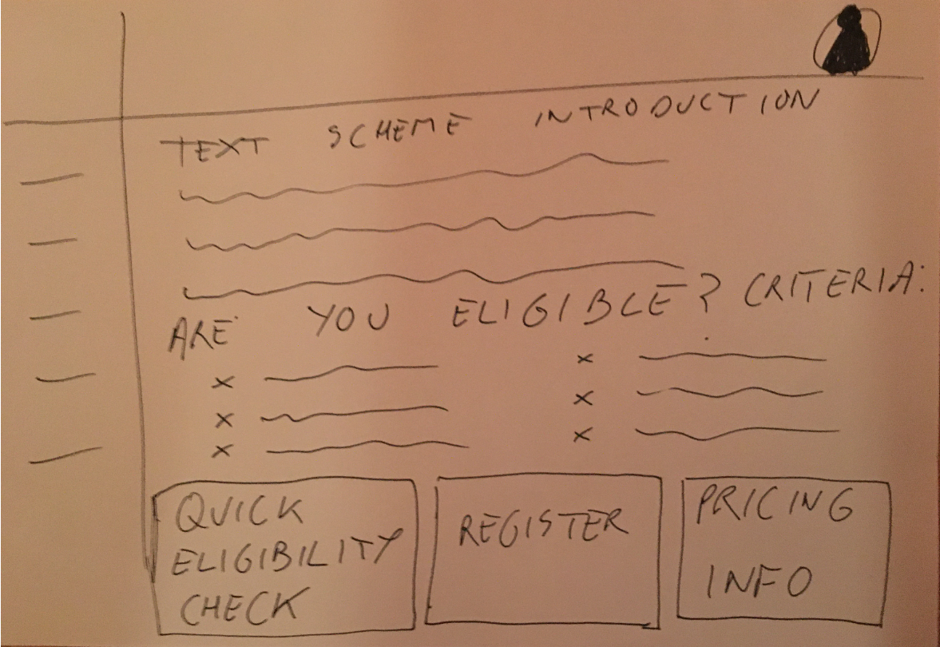
The Quick Eligibility Check
This step was found to be quite sound; a number of textual changes are suggestion. A quick one line introduction, in order to undertake the check, ‘you need to enter your Eircode and find your school to calculate distance’. Then breaking the section into two simple steps:
Enter your Eircode
Select your School
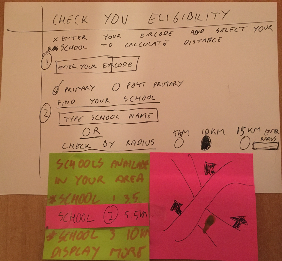
We are going to assume the user is eligible and these two options will display:
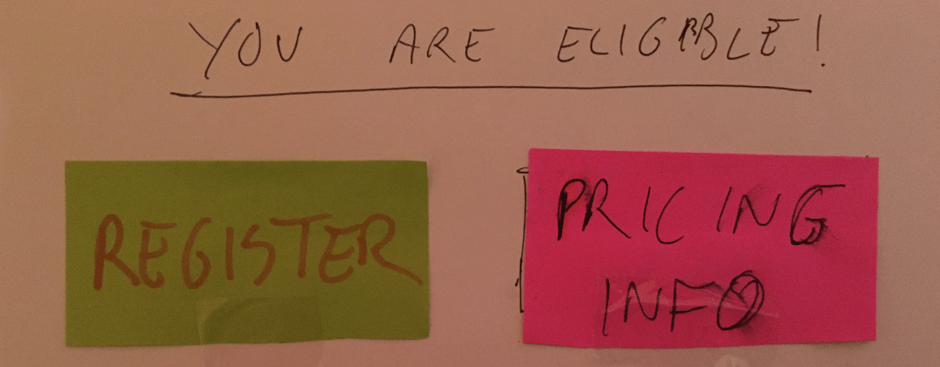
The PRICING INFO button, will hyperlink to a new tab in order to try and de-clutter the flow and keep the user moving along the process. It is there for informational purposes and the user is not paying or even registered at this stage. This alleviates the issue raised in the user research:
‘Pricing Information on the landing page should come with a note’
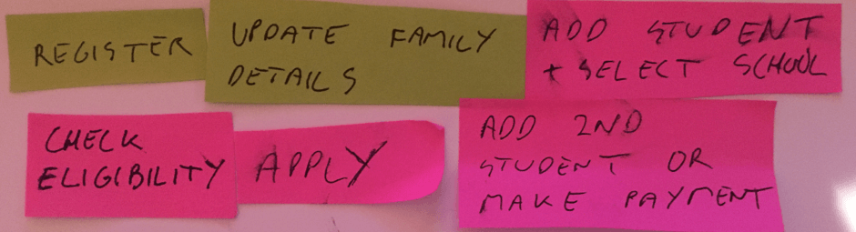
If the user hits REGISTER, initially, the team went for these steps in the process:
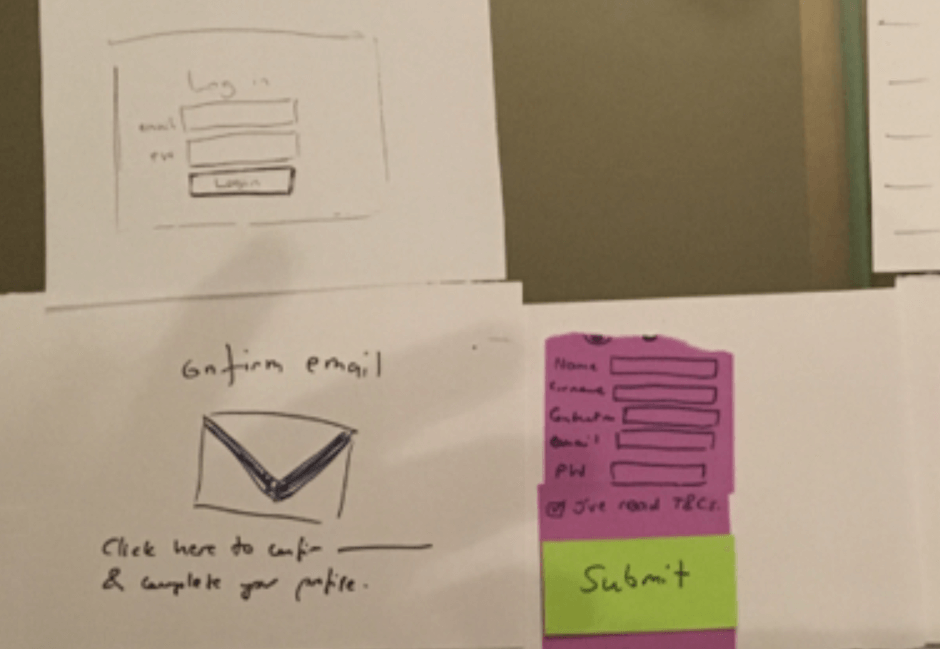
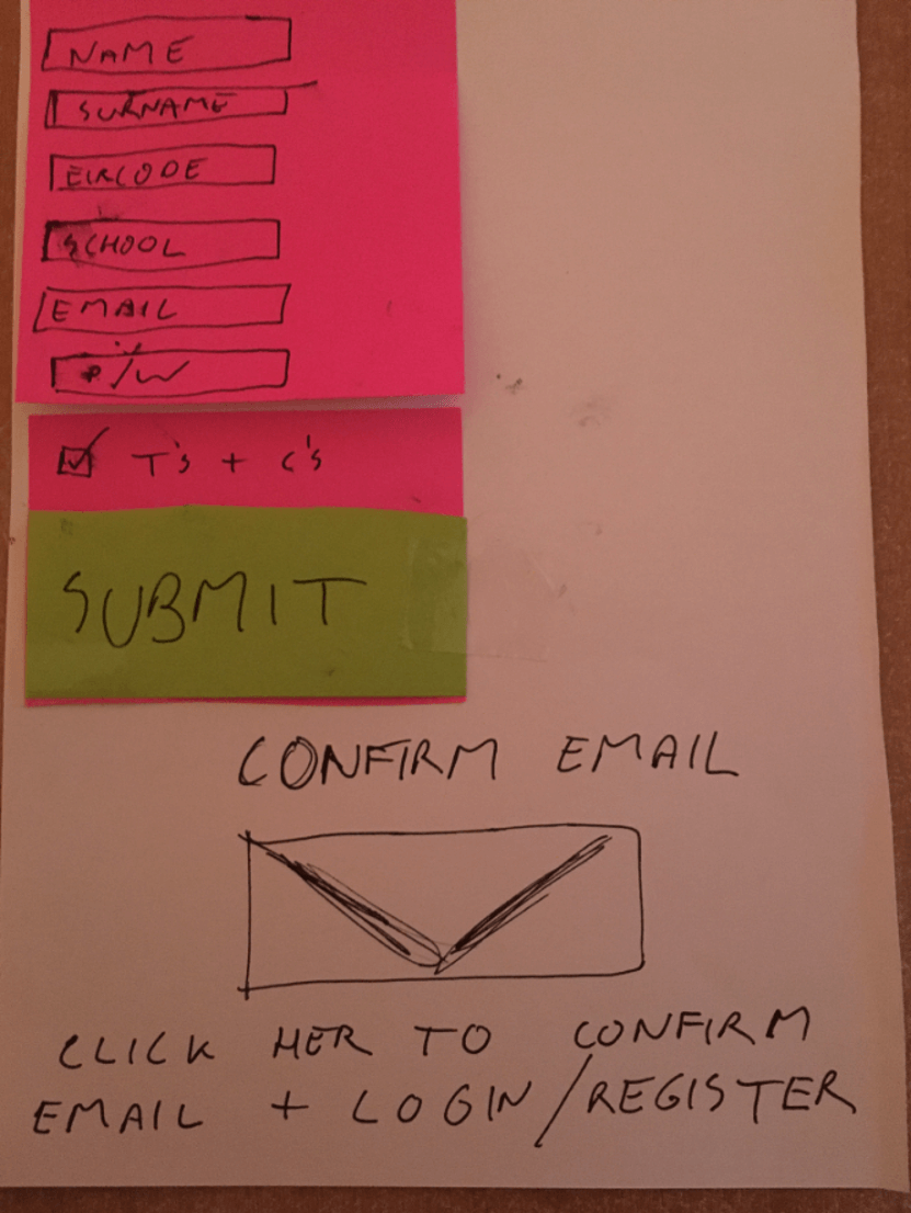
Specifically, the Registration form:
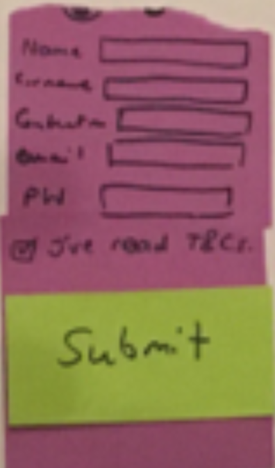
What data could be extracted from the Quick Eligibility test, in order to avoid duplication? Could it pull the users Eircode and also the preferred school?
A step was removed, using the confirm email link, the active link will send the user straight back into the process, as opposed to landing on a login page. So, the link will read within the activation email:
Click here to confirm your email and continue your School Bus Transport application.
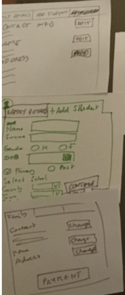
The two primary design stages once logged in as a registered user is the Family Tab, Adding a Student and also where the Payment link is. The Payment process once clicked, is very familiar which satisfies: Consistency and Standards within Neilson’s heuristic design process – these steps don’t require addressing.
At this stage the user lands on the Family Details Tab, which is now prepopulated (if the user undertakes a Quick Eligibility Check), with Name, Surname, Eircode.
However, a breadcrumb flow would be embedded into the top navigation within the application app, which would look like:
This would satisfy the concerns noted such as:
‘There should be documented PROCESS STEPS, you are here and you need to get to here…’
‘After a student is added, the next step needs to be clearer – making a payment’
‘The guess work for the user needs to be removed’
This functionality also allows the user to Exit or go Back troughout the hole process, providing the user with full control and empowerment.
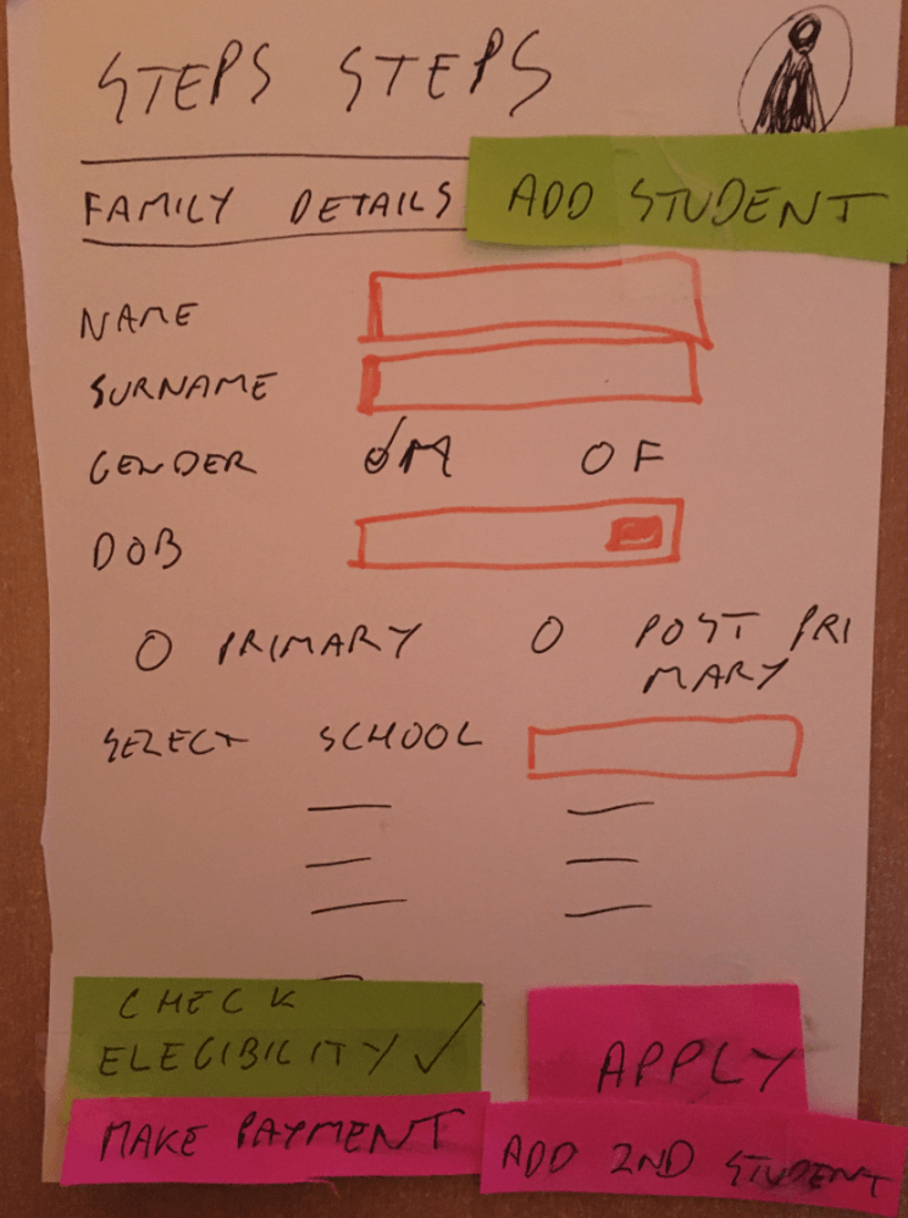
Family Details – Add Student – Make Payment
The final three interfaces (apart from the standard Payment Process), which are; the Family Details Tab, the Add a Student and Application Summary Tab and Add More Student. This layout was considered well from the user research; however, a few points were notes:
Family Details – Add Student – Make Payment
Initial Prototype
Issues of Pain/Note from User Research:
‘When a user adds a new student – there should be a button sending them to the Family Tab in order to make a payment’
‘Adding a second child needs to be clearer, the Tab text more descriptive and ‘Add another Child’ button should be included at the bottom within the tab’
Buttons to the bottom of the tab interface, quickly allows the user to Add a second student and also clicking both APPLY and MAKE PAYMENT will take the user to the Family Tab which will now contain a Make Payment Button as a student has been applied and that application is eligible.
User concerns around future communication including:
‘And there should be an Application Status section and timeframes for communication’
‘Preferred Forms of communication should be available: Email or Post’
These would be addressed by email and a Family Tab would be updated a Status update and an email triggered if the Application Status is changed.
The point from the user research which seemed to confuse all users was the Guideline buttons:
‘The Guideline Buttons need to positioned somewhere else, they are confusing as to the process flow’
These would be positioned to the left-hand menu.
The Reviewed Protype from Eligibility to Application is:
Conclusions
Ideally, this application process should be on a separate website, this would instantly de-cluttered and simplify the design and the user experience would benefit. Again, adhering to the Aesthetic and minimalist design encouraged by Neilson (1994).
Further testing and usability would need to be undertaken to test all scenarios. The testing documented within this blog post focuses on an ‘Eligible’ result. Non Eligible user flow would need to be analyses and incorporated into the user flow.
Unfortunately, as a team it was difficult to meet and discuss this prototype as a team, and thus this prototype creation was without group analyses and reflective consideration.
References
Nielsen J. (1994) Usability Engineering, Morgan Kaufmann Publishers Inc.
Related Posts:


Comments are closed.