Presenting and Discussing a UX Website prototype for Bus Eireann School Transport Website
Introduction – UX Prototype, User Research and Feedback
The previous blog post in this series focused on creating strong empathy for the users of the Bus Eireann School Transport website, which was aided by the creation of two persona’s, empath and journey maps. User research through the use of a short questionnaire was also conducted in order to establish a number of pain points within the website design and process.
Finally, a competitor analyses was undertaken in order to compare best practice across the transport sector and outside the section. This analysis provided creative idea generation and design solution which coupled with the user research carried out.
This blog post will first touch on a summary of the pain points and user objectives documented in the research within the registration and application process
User Objectives and Pain Points – Summary
General User Objectives:
I want to Register – Apply – And Get my Children on a School Bus
I want to know if I am eligible
Kick off the process, so, I can get notification that I am on the waiting list
Complete the process and put it to bed
Pain Points:
No Pre-Registration Eligibility Criteria Listed
Eircode would not match and did not seem to work
Unnecessary Compulsory Fields and Duplicate Fields
Not inform bullet point information
No visibility as to how the application is proceeding
Not Very clear, too many assumptions were required
Based on the issues presented above through the user research and heuristic evaluation, a number of user flow maps and hierarchies were generated in order flesh out some idea generation. The iterations helped the team discuss, dissect, empathise and visualise possible best human centred design which would satisfy the persona’s identified, Aoife and Sean. It allowed the team an opportunity to problem solve and apply critical user centred thinking.
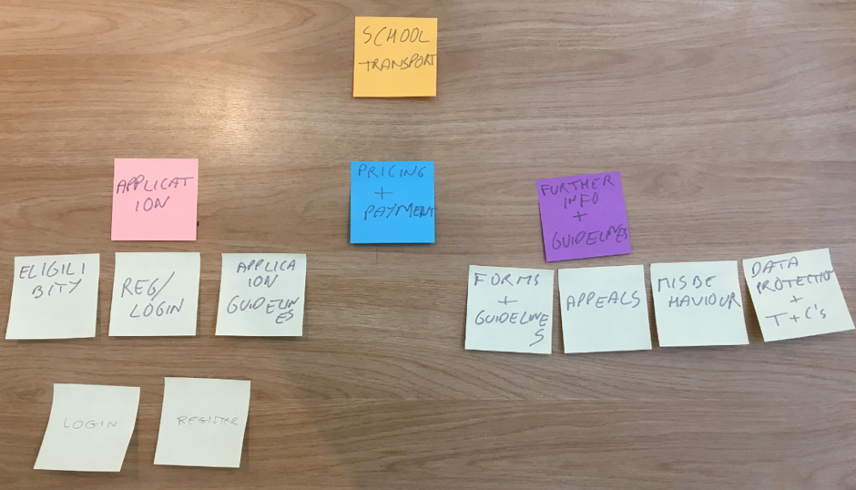
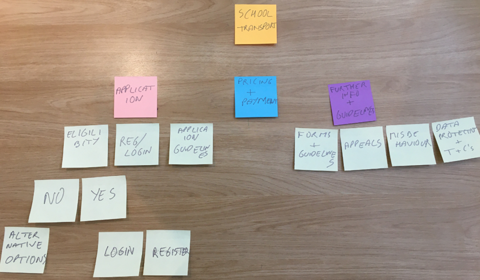
The Design Iterations on Post-its Mapping
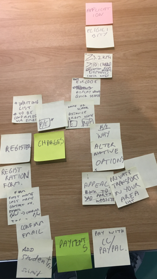
With this Registration and Application process roughly mapped out, the team went about sketching the user flow in more detail. For example:
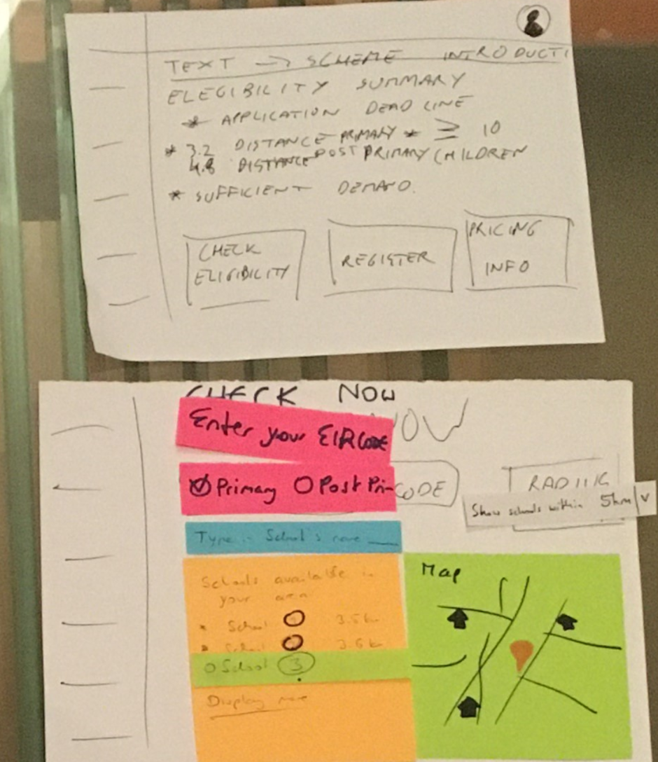
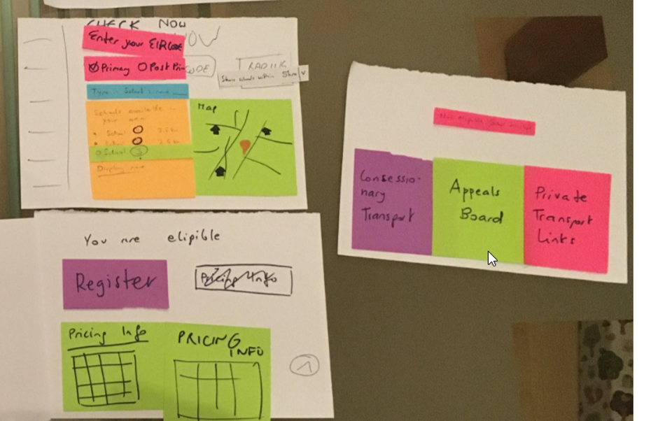
The initial ideation was to remove the frustration and inform Aoife and Sean as quickly as possible. A Quick Scheme Introduction and then an Eligibility Summary and then three options all clear and above the fold (employing the Power of Three as a form of influence and user memory), providing the user with three familiar options and complete control:
CHECK ELIGIBILITY REGISTER PRICING INFO
The team predicted that the user would read the eligibility bullet points and register. Or, read the bullet points and go to eligibility and then register. This user behaviour would need to be analyses with a decent sample size. However, all three options are available and clear.
The Eligibility check consisted of location (Eircode) and location of the school – distance between both. A Radius Map would easier list the schools within the proximity and the user also has a Type School field. This is a quick verification/eligibility check.
If the user is eligible, then they can register or if ineligible alternative options are available.
We considered pricing important, so it was positioned under the Register button in a table form for information purposes.
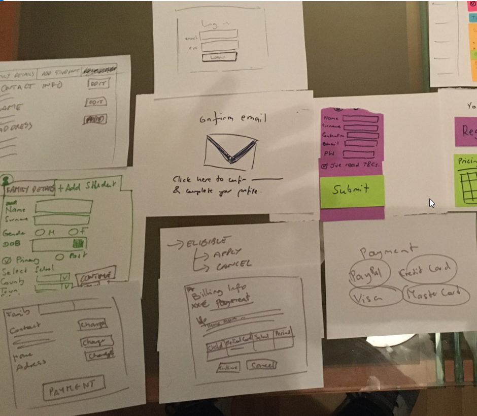
The user flow then followed the registration and application steps, see:
At this stage the UX team constructed a working version of the prototype flow, and asked four prospective users to test and provide their feedback. These videos were recorded and users behaviours was also recorded from a laptop. The prototype, user research videos including verbal feedback and summaries are:
Bus Eireann – School Bus Programme – Prototype User Testing Feedback
Interview One – Summary & Interpretation of User Comments
Eligibility Summary is clear and helpful
What does the eligibility criteria mean to me? Bullet points need to be detailed here
User went straight to Register
Pricing Information on the Register Page – could be causing the user issues, as in, why is this information here and what do I have to do? Text should be included here to explain that this Pricing Information is for informational purposes only and payment can only be made once registered
When the user is on the Student Details tab, the user enters the data, but is unsure what to do once completed – there is a need for a button here or instructions to tell the user to click on the Family Details tab in order to pay
Payment process is clear and familiar to the user.
Overall Feedback – More Back Options and good information, Payment section should be clearer around full and 50% payment. There should be a Payment button on the Add Student tab. Left hand menu is good.
Interview Two – Summary & Interpretation of User Comments
User when straight to check eligibility
The ‘greater than or equal to’ icon the users may not understand this symbol
The Alternative Options would have been used by the user
User was unsure what/why the two guidelines buttons were there
To add more than one student – was not clear how to add a second child. Child Added – Add another Child button
History of transactions would be handy for the user.
Interview Three – Summary & Interpretation of User Comments
User not sure of school’s spelling. Radius Functionality was very convenient
Check Eligibility – they user was unsure why there were doing this test – a note should be included – ‘check how far your school is from your EIRCODE – enter your EIRCODE and Select your school below’
Guideline buttons were confusing
Create Account button should be to the right. Cancel button is too bright
Add Student tab should be renamed: Add Student for School Transport
No Application Status
Add Another Child should be at the bottom and top
The user is unsure as to what to do next – where do they go, what do they do
The user guesses that ‘they want payment’ – there needs to be instructions here. ‘It is not telling me that I have to’
Is the Full Amount for the full year. – Should be made clear the user can only pay for a full academic year. Joining mid academic year does not constitute a discount
There needs to be STEPS – that is what I need to know – what are the steps in the process – STEP PROCESS
Timeframe should be clear – what will happen when
Email or text for further communication – post is not desired
Pricing needs to be clearer – what happens if I go to a school mid-year?
What does the user have to do, the process is unclear.
Interview Four – Summary & Interpretation of User Comments
User was concerned about price – that was his first click
Step two – Check Eligibility
Good functionality on Search and Radius functionality
Add Student Field wasn’t obvious
Wasn’t clear what to do once Apply was clicked – no confirmation
Did not know where to go in order to pay
Payment process very clear and familiar
Approved Application and application summary box should be clearer
Summary & Suggested Improvements
Utilising Neilson’s (1994) heuristic evaluation and applying it against the user feedback, a number of common trends have come to the fore. The overriding concern and theme from the test sample is that users want to be informed and communicated with. The prototype is certainly an improvement on the live Bus Eireann website; however, the user research has identified these core issues with the prototype:
There should be documented PROCESS STEPS, you are here and you need to get to here…
And there should be an Application Status section and timeframes for communication
The Reasons for doing the eligibility check should be made clear to the user
Pricing Information on the landing page should come with a note
When a user adds a new student – there should be a button sending them to the Family Tab in order to make a payment
After a student is added, the next step needs to be clearer – making a payment
Adding a second child needs to be clearer, the Tab text more descriptive and ‘Add another Child’ button should be included at the bottom within the tab
The Guideline Buttons need to positioned somewhere else, they are confusing as to the process flow
Button colours need to addressed and streamlined
The guess work for the user needs to be removed
Preferred Forms of communication should be available: Email or Post
UX Prototype & User Testing Conclusions
The next phase in the UX design process is to design a final user flow prototype based on the critical appraisal of the low fidelity prototype, the feedback from the test users and adhering to Neilson’s best design and UX practice principles.
References
Nielsen J. (1994) Usability Engineering, Morgan Kaufmann Publishers Inc.
This website or its third-party tools use cookies, which are necessary to its functioning and required to achieve the purposes illustrated in the cookie policy. If you want to know more or withdraw your consent to all or some of the cookies, please refer to the cookie policy.
By closing this banner, scrolling this page, clicking a link or continuing to browse otherwise, you agree to the use of cookies.