


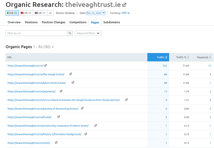
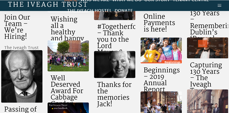
The Iveagh Trust is oldest housing authority in Ireland, based solely in Dublin managing over 1550 houses within inner city Dublin. The trust recently launched a new website (https://www.theiveaghtrust.ie/) and the most recent data suggests that the primary users of the website are current ‘residents’ and the most popular section of the website is the ‘Latest News pages’ section of the website and the ‘Online Payments’ page.
Organic Search Results for www.theiveathtrust.ie (Source, www.SEMRUSH.com)
The Iveagh Trust has been in existence since 1890 and many of the residence will be in the later years of their life. From an accessibility perspective these residents may have common old age issues such as, poor impairment, blurred vision, a weakened grip, restricted movement or joint pain. The initial objective is to access and audit the website from an accessibility, inclusive and universal design perspective for an older audience who may have failing eyesight or be digital immigrants. But first, what is Inclusive/Universal Design and Accessible Design?
Universal design describes a set of considerations made to ensure that a product, service, and/or environment is usable by everyone, to the greatest extent possible, without the need for adaptation or specialized design (Featherstone, et al, 2016). “Universal Design” aims to extend standard design principles to include people of all ages and abilities, but remains at the level of generality, so it does not address all the specific needs of any particular disability. (Usability First, n.d.). UD is a goal that puts high values on diversity, equality, and inclusiveness (Burgstahler, 2015), however, “Accessible Design” calls for design that includes the needs of people whose physical, mental, or environmental conditions limit their performance (Usability First, n.d).
In relation to The Iveagh Trust website, universal design applies to best practice website design experience to all its general users, however accessible design encompasses the needs of specific users with a particular impairment, such as a visual impairment. However, Quesenbery (2014) maintains that ‘using the accessible UX principles and guidelines, you can create websites and web applications that work for everyone—including people with disabilities.’
In order to identify Design and Accessibility issues it is necessary to undertake an audit of the website based on W3C Web Content Accessibility Guidelines (WCAG) 2.1 (W3C, 2018), in particular the website homepage and the Payment page on a mobile device.
Accessibility in design allows users of diverse abilities to navigate, understand, and use your UI (Material Design, n.d.). Is The Iveagh Trust website layout clear with a strong call to action? Is the site robust, catering for all types of users and does it support assistive technologies?
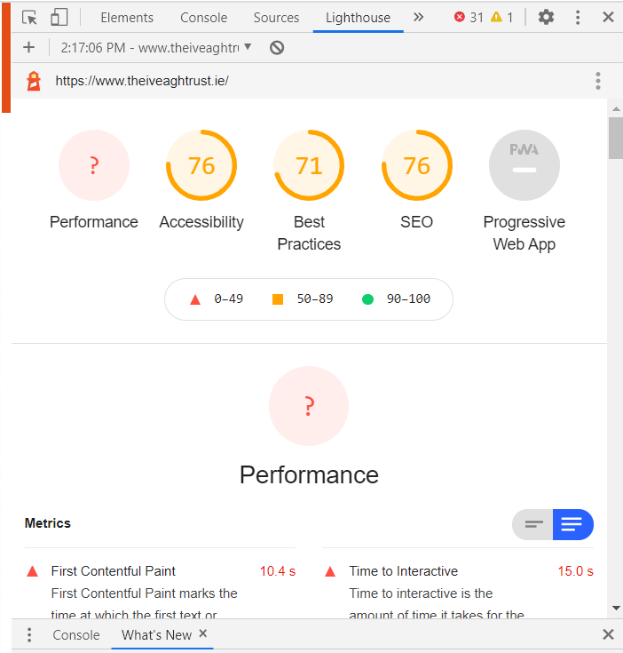
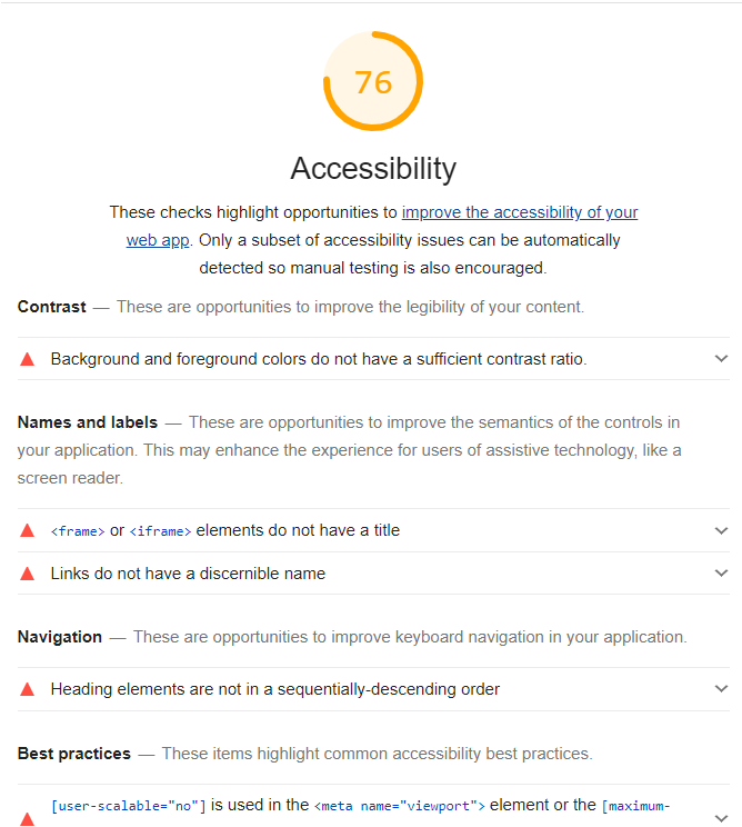
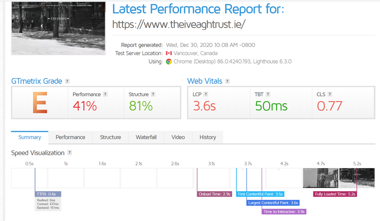
An initial Accessibility audit from Lighthouse gave the website a 76% accessibility score and highlights areas for improvement, including:
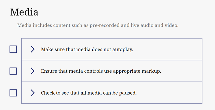
The content audit for the site was based on the Web Content Accessibility Guidelines (WCAG) 2.1 (W3C, 2018), which consisted of 4 key content principles:
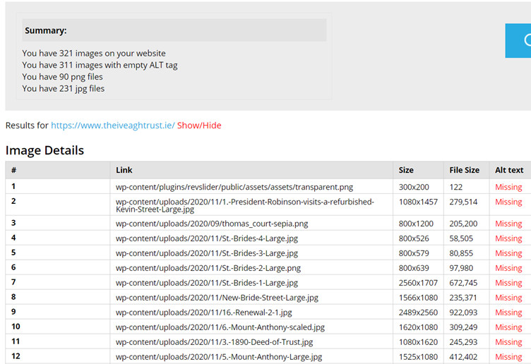
Perceivable – is information on the website presented to users they can perceive? For example, there are 321 images on the website and 311 without an alt tag, (source, https://www.digitalsales.ie/alt-tag-checker.php), how might a blind person perceive their experience?
Operable – the website components and navigation must be operable, does it work using a keyboard, is time provided, does the site flash and is it easy for user to find their way about the site?
Understandable – is the website clear and easy to understand.
Robust – can the site be interpreted be a variety of user agents?
From an automated audit on the Bureau of Internet Accessibility website, the report found the site failed the following content strategy checks:
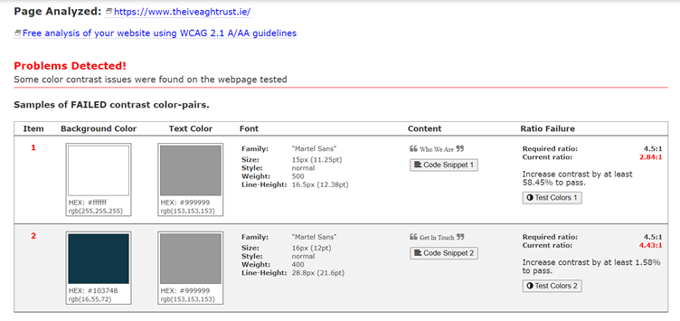
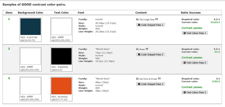
WCAG 2.1 best practice states that text colours must have sufficient colour contrast against background colours, making it easier for users with poor vision. Using this tool from a11y (https://color.a11y.com/Contrast/) to analyse the current sites colour contrast found:
Undertaking a number of the Usability Checks from A11Y Project (https://www.a11yproject.com/checklist/) also exposed some areas of the site which could be addressed in a redesign and also validate issues on the site.
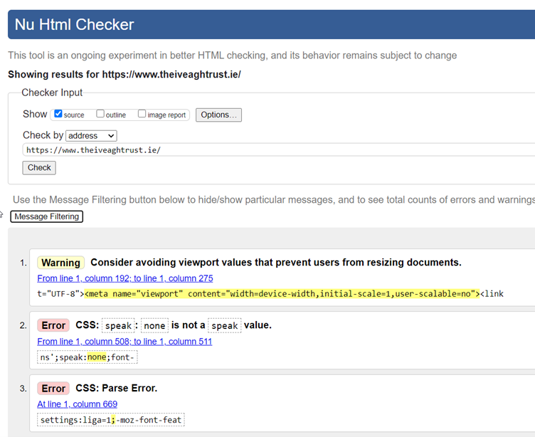
62 Errors using: https://validator.w3.org/nu/
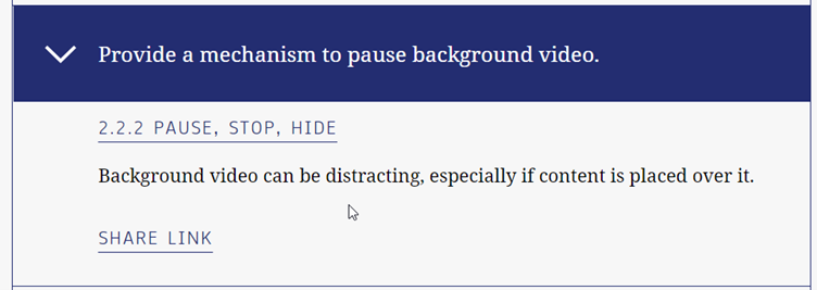
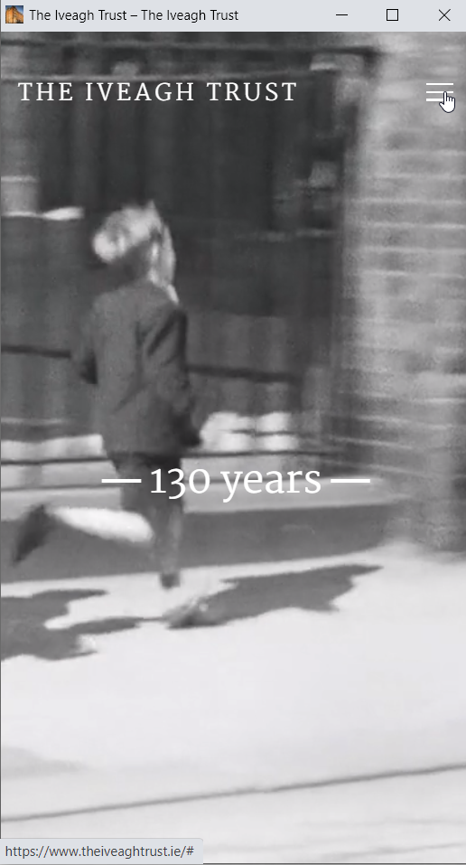
It is clear that the video on the homepage does not provide the user with the option to stop, pause or hide, considering the user is most likely a resident who has seen the video countless times. In fact, the video appears to be effecting the page download speed for the site, taking over five seconds to load:
From Organic Search data, traffic to Latest News pages has significant volume, users appear more interested in what might be happening in the community if they are returning visitors. This is both a universal design and accessibility issue.
If the user had ownership of the homepage layout this would provide absolute ownership and achieve universal design to a very high degree. A user may decide to set or pin the Latest News Section above the fold and hide the video for returning visits.
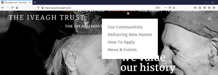
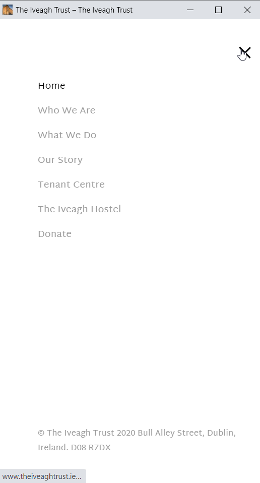
Top Navigation links and Link Sizes
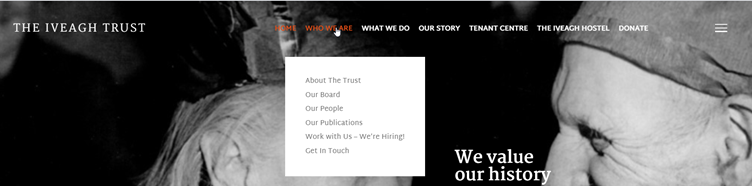
The other significant accessibility issues present on the homepage appear to be the size of the primary links, especially considering the unused space to the left of HOME (a link which should not display on the homepage). The primary top navigation links should inform the user that there are sub menus.
Such as this example:
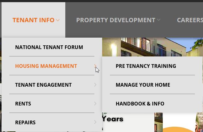
This issue is more pertinent on mobile, what is the user to do?
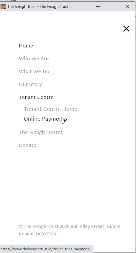
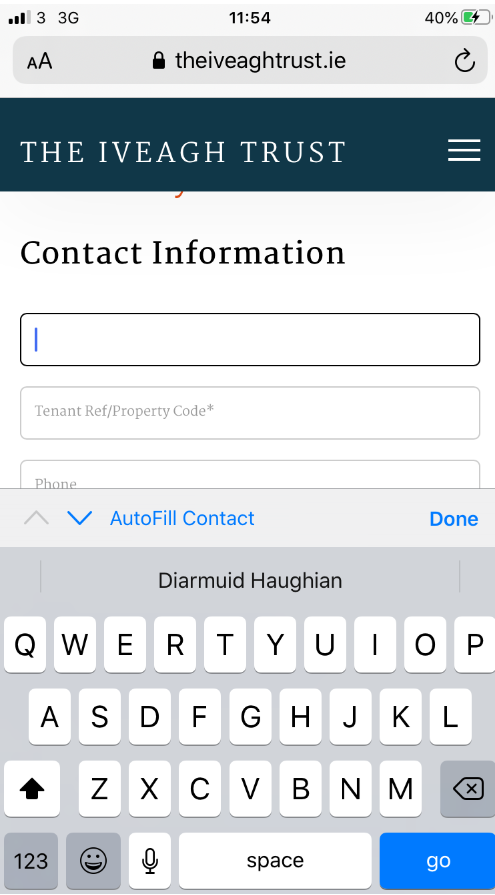
Which takes us to the Payment page on a mobile device, another very popular page on the website. How does this page relate to Universal Design and Accessibility? How might it be improved?
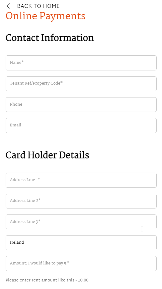
According to Universal Design, (n.d.) some of the guidelines for the design of forms which have not been applied to this form on mobile, include: ‘Give the form a clear title’:
Pay your Rent Online
as opposed to:
Online Payments
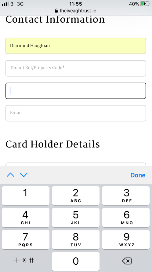
The heading would help the user ‘identify whom the form is for and its purpose’ (Universal Design, n.d.). The Contact Information heading could be changed to:
Tenant Contact Information – making the form obvious (considering a relative could pay rent on behalf of a tenant).
Tenant Ref/Property Code is a required code in order to complete the payment. Awareness can be raised with an obvious note on the top of the form:
“Before you begin, you will need a Tenant Reference or Property Code in order complete your rent payment”
Auto populate is on the form is available and the Digit interface is available on the Phone field, however the Alphabet interface is on the Amount field which should be a Digit interface.
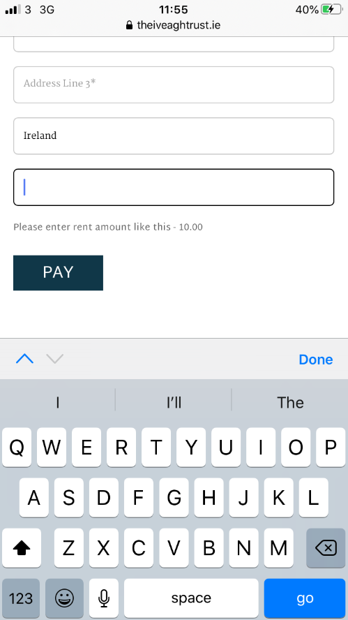
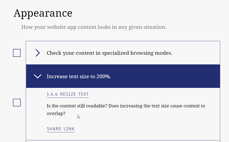
Wroblewski (2008) make font sizes large to read…the best solution is to allow users to select their own fonts and sizes, which also means that your page has to be designed so that it scales well with large fonts, up to at least 14-point.
Wroblewski (2008) also argues that it is generally not a good rule to use labels within inputs for non-obvious questions. All questions on this form are very obvious and require no need to reference the question, however a revision of the form may allow the label to pop up over the field as the user starts to populate the field, a floating label. Ideally, the labels should remain visible even after completing the field. For example:
There is also no obvious option for the user to cancel out of the process, to the right of the PAY button, there should be a Cancel link which takes the user to the homepage, for example:

Many of the Universal Design principles such as People First, Clear Purpose, Easy Interaction, Helpful Way-Finding have been ignored or poorly employed withing the website. The audit has exposed the UD and Accessibility issues within the site and highlighted potential solutions. The next blog post will focus on defining a clear problem statement and users profiled based on inclusive design.
Featherstone, D. et al, (2016, Oct 25) Complete Beginner’s Guide to Universal Design, UX Booth. https://www.uxbooth.com/articles/complete-beginners-guide-to-universal-design/
Burgstahler, S. (2015) Universal Design: Process, Principles, and Applications. https://www.washington.edu/doit/universal-design-process-principles-and-applications)
Material Design (n.d.) Accessibility. https://material.io/design/usability/accessibility.html#understanding-accessibility
Quesenbery, W. (2014, Jan 15) Accessible UX Principles and Guidelines. https://rosenfeldmedia.com/a-web-for-everyone/accessible-ux-principles-and-guidelines/
Universal Design (n.d.) Form Design. http://universaldesign.ie/Products-Services/Customer-Communications-Toolkit-for-the-Public-Service-A-Universal-Design-Approach/Written-Communication/Form-Design/
Usability First. (n.d.) Principles of Accessible and Universal Design. https://www.usabilityfirst.com/about-usability/accessibility/principles-of-accessible-and-universal-design/
Wroblewski, L. (2008) Web Form Design, Filling in the Blanks, Rosenfeld Media
W3C (2018). Web Content Accessibility Guidelines (WCAG) 2.1. Retrieved from https://www.w3.org/TR/WCAG21/

