


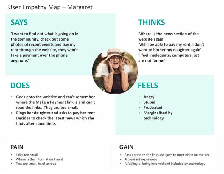
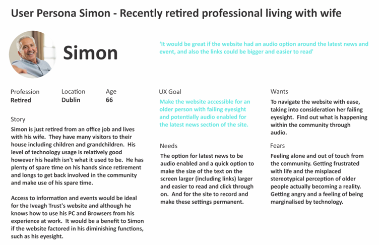
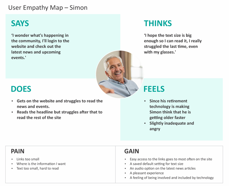
From the initial Universal Design (UD) and Accessibility audit of the website it was made clear that not all users were fully considered when the site was designed and coded. In order to properly address the issues identified, it is important to document the problems and attach personas and empathy towards users of the website which have been overlooked in the design, UX and coding of the website.
This profiling would then highlight and expose areas for improvement for users who may have accessibility concerns such as Simon and Margaret.
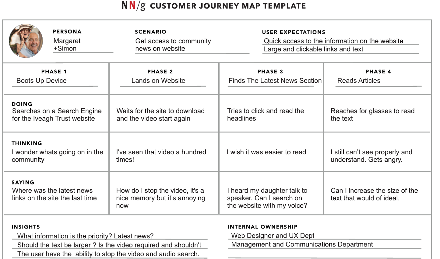
Customer Journey Map – Template (Source: https://www.nngroup.com/articles/customer-journey-mapping/)
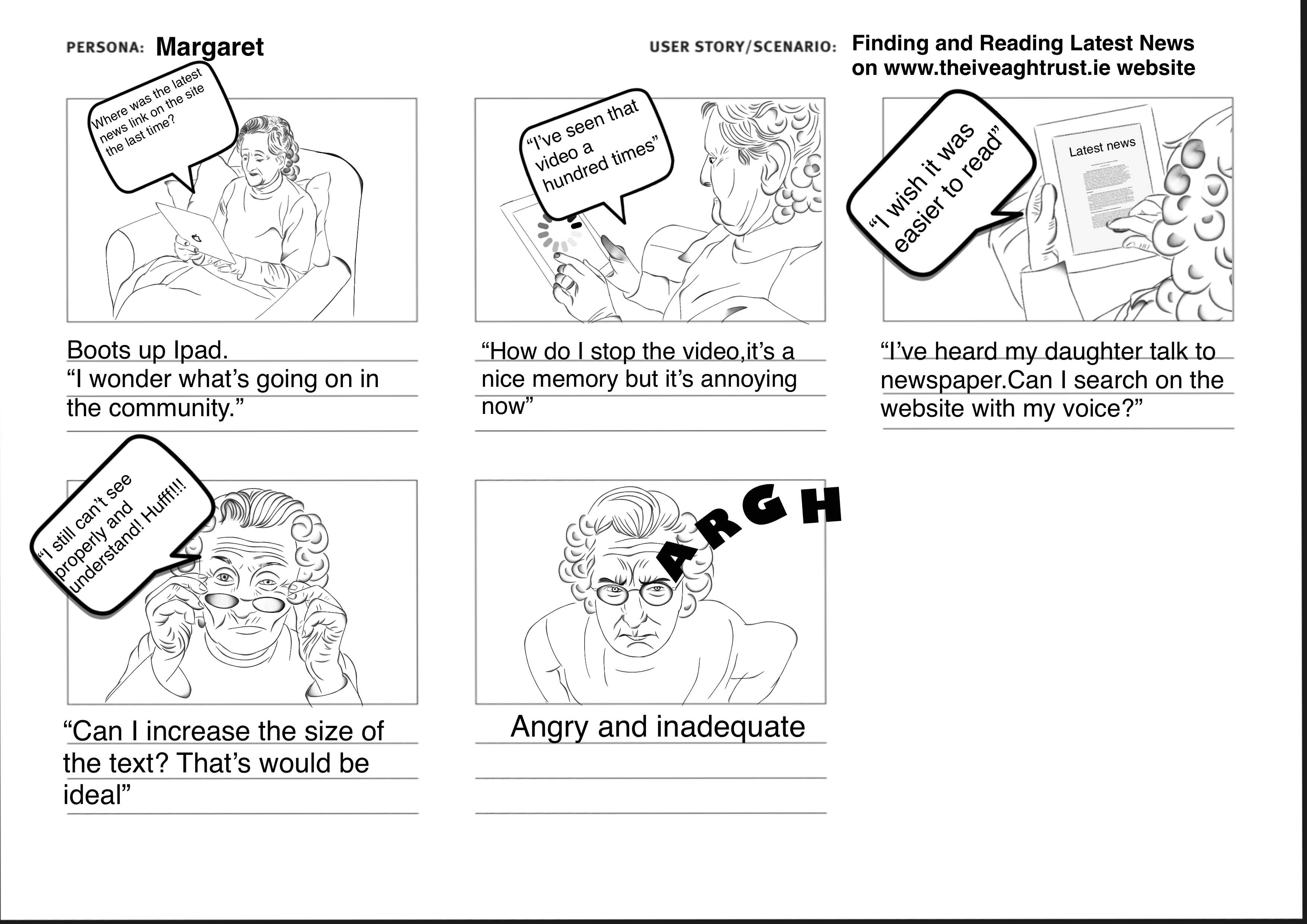
A problem statement has now become clear:
‘Margaret and Simon require a website which will display the information they require quickly, and which is easy to read or hear.’
The next stage in the process is to address the issues identified in the UD and Accessibility Audit, coupled with the persona and problem analyses. Possible inclusive design solutions could be:
Allowing the User to Pin Latest News to the Above the fold section of the site
Embedding Traditional and Audio Search Functionality into the top navigation of the site
2. Giving the user the ability to stop the video on the homepage
3. Embedding Accessibility Icons onto the homepage of the site (Contrast, Bigger Text and Pause Animation)
4. Signposting the Top Navigation Links
5. Address the Payment Page on mobile devices: Descriptive Headings, Notice text before the user starts the form, red asterisk, floating labels, digit interface for amount field, larger text and the option to ‘cancel’ out of the process.

